| Erzherzog Johann | 28 Sep 2021 1:43 a.m. PST |
I'm painting some chasseurs a cheval and I'm not sure about facing colours. There is a great resource for Austrians, giving the best Vallejo colour match. I wonder if there is antything like that for the French, given the caveat about colour fastness, batches etc etc. I know in a discussion recently aurore was matched to Vallejo German Orange. I think their Deep Sky Blue is a good match for Regt 16's bleu céleste (Sky Blue). But the one I'm wondering about is capucine. I thought it would be a lightish brown, presumably named after the colour of a capuchin monk's robe. But looking at 1789-1815.com/arfr4_ch24.htm (thanks to the person who posted this link) it looks quite orange, yet it must be different to aurore. I wondered about Vallejo Orange Brown but I think it's more brown than orange, maybe too brown. Basically, there's:
Orange Regts 13 – 15
Aurore Regts 19 – 21
Capucine Regts 22 – 24 Does anyone have any advice they can offer? Ideally for Vallejo as they are the easiest for me to obtain and I already have some – I'm just not sure which to use. I'm working in 15/18mm. Thanks,
John |
| Ryan Zulu | 28 Sep 2021 3:21 a.m. PST |
I think the attached link might help. It shows a trumpeter, with the facing colour being his main. I'd suggest the vallejo colour might do the job. link link |
| SHaT1984 | 28 Sep 2021 9:41 a.m. PST |
In 15mm does it really matter?
The amount of 'facing' vs green is pretty wide.
I'd just tone down the bright standard colours w a dash of white, or off-white linen colour, and be happy.
Though I have no knowledge of the paint you reference. I was making my own aurore for my guard, but in the end I'd nearly repeated a stock shade anyway. It's amazing how the homan brain interprets colours used in different combinations, but my new solution is close enough to the illustrations of Rousellot for me,
cheers d |
| Andyuk | 28 Sep 2021 9:44 a.m. PST |
I always thought of Aurore as a dark orange |
| Erzherzog Johann | 28 Sep 2021 10:09 a.m. PST |
Thanks for the responses. I take your point Dave, but for the musician in a coat of the facing colour it sort of does, if only because I want the satisfaction of knowing they aren't the same colour as the aurore-faced unit I already have . . . I know getting the right colour for anything in Napoleonics is more questing beast than holy grail! Cheers,
Dave |
| SHaT1984 | 28 Sep 2021 9:14 p.m. PST |
>>I always thought of Aurore as a dark orange Absolutely not.
Maybe that's a problem of using "salmon-pink" as a cue descriptor; it is not modern red salmon orange but subtle soft pinkish-orange at the other end of the spectrum. I'm also to 'create' a new brigade of legere (next year I imagine my 2021 plans have derailed already), and the prime new unit will be the 22eme too! Thankfully 'Capucine' has no relationship to cappuccino, but it sure does help!
d |
| Erzherzog Johann | 28 Sep 2021 10:57 p.m. PST |
Dave:
Thankfully 'Capucine' has no relationship to cappuccino, but it sure does help! Yes. I thought it would refer to Capucin Monks' gowns but that's clearly wrong too. I think cappuccino refers to their gown colour. So I wondered what it does refer to. At least I wondered as far as google translate . . . Ah, I have that colour nasturtium in my garden so now I know :~) Looking at the various paintings of the 24th chasseurs a cheval, I think Vallejo Orange Red 027 (70.910) looks good. It's really only for the musician in a capucine coat where such a close match will matter. So as far as Vallejo is concerned, I'm thinking:
Orange Regts 13 15 -- Bright Orange
Aurore Regts 19 21 -- German Orange
Capucine Regts 22 24 -- Orange Red Thanks everyone!
John |
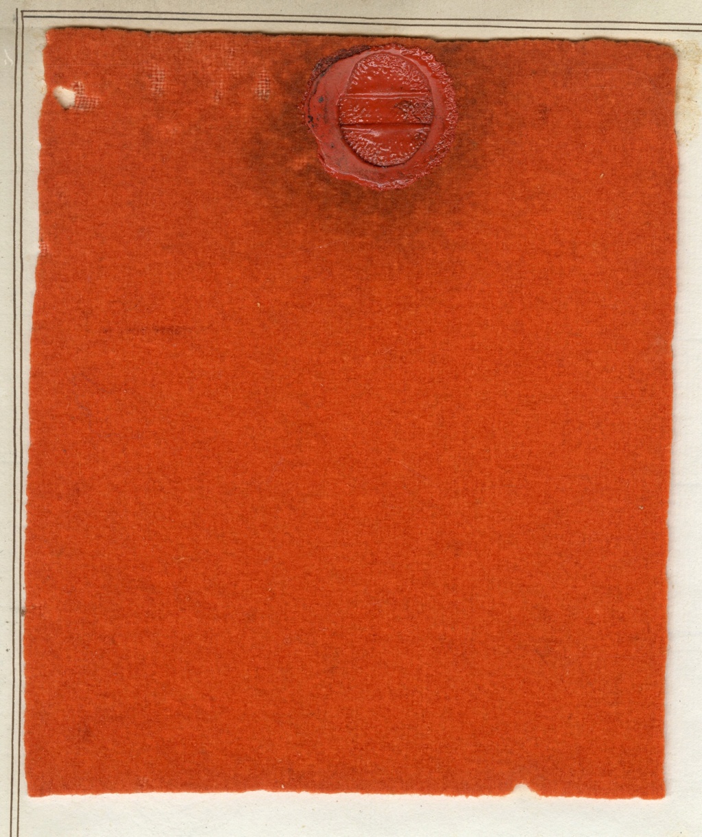
| Lilian | 29 Sep 2021 9:21 a.m. PST |
Aurore sample of 1823 shared by Yves Martin
|
| SHaT1984 | 29 Sep 2021 5:37 p.m. PST |
There's the TMP link posting with Hourtoulle/ Jouineau colours but take your chances. That cloth patch appears to be much redder and darker than any extant aurore artefacts I saw and got to handle (mostly La Garde of course). Sure they would have suffered some fading but I don't believe any depiction of contemporary uniforms, bar one in Lachouques 'Anatomy of Glory', shows anything like it. I've checked my slide collection- here is an example of the 22eme, despite the poor incandescent lighting, you can easily discern the difference between capucine facings and the 'normal' scarlet of his veste, the schabraque edging, the grenadiers red and even that of the Hussar etc.
w27 Exhibits Chateaur de l'Emperi Case_ed©dww 1984-2021 by DaveW, on Flickr. -- I've left the photo full size on the site so recommend using that-- Yes these are 'composites' uniforms, using whatever parts were available to the Brunons to complete a feature vignette, for which we should be extremely grateful I believe. They are however, authentic. Yes we also have nasturtiums and I should have referenced that earlier! Both decorative and tasty, I keep them cropped for use in salads!
Santé ~davew |
| Erzherzog Johann | 29 Sep 2021 10:40 p.m. PST |
Thanks Dave,
It looks more like a yellow nasturtium than an orange one.
Yes, I eat them too, flowers and leaves :~) |
| SHaT1984 | 30 Sep 2021 1:06 a.m. PST |
Welcome John.
BTW to my mind the ultimate source for comparison of 'aurore' is the good old 'Marins' de la garde. They have a good portion of it and when compared against the dark blue gives you a very good comparison.
regards d |
| Michman | 30 Sep 2021 1:49 a.m. PST |
orange
19 à 21 : aurore ; lighter orange, a little pinkish
13 à 15 : orange ; orange
22 à 24 : capucine ; darker orange, a little brownish red
7 à 9 : rose ; lighter red, a little pinkish
1 à 3 : écarlate ; lighter red, a little orange-ish
25 à 27 : garance ; deep/saturated red
10 à 12 : cramoisi ; darker red, a little purplish other
4 à 6 : jonquille ; light yellow, trended darker/more saturated year by year
16 à 18 : bleu céleste : sky-blue, trended darker year by year Contemporary "aurora" ….
Martinet :
Bardin :
Miniatures :
|
| Erzherzog Johann | 01 Oct 2021 1:34 a.m. PST |
Hmmm,
Now I'm torn – is it the more yellow colour in Dave's slide, which could be faded (red tends not to be colourfast so it could end up yellowish), but it's the genuine article? Or go with this (http://www.1789-1815.com/arfr4_ch24.htm#tr) much more orange colour, but from a painting rather than the real thing? |
| SHaT1984 | 01 Oct 2021 2:55 a.m. PST |
John if you believe the orange would have faded that much, why hasn't the other reds done likewise? I'm happy with my choice; I'll probably put a slice of red in the standard colur I use for aurore and bring it to a borderline pale tangerine. I'm known to put a slash of 'highlighter colour' over the top if I don't get the effect I'm after. That creates a hi-lo shadowy effect that will fool the eye as to hat its looking at.
d |
| SHaT1984 | 01 Oct 2021 10:38 a.m. PST |
@Michman
I know you mean well, but those modern reproductions are probably not the best indicator of actual period colours- neither the management nor the production of such material would have been adequately controlled for accuracy. Even the Martinet have been produced with a variety of shades and colourations by uncaring printers; and frankly the originals lost credibility when I discovered that even they produced 'fakes'- uniforms for the 17e and 18e Chasseurs á Cheval that had not even existed for a decade!
regards d |
| Erzherzog Johann | 01 Oct 2021 11:27 a.m. PST |
That's a valid point Dave about the other reds fading. I think Vallejo Flat Yellow with a dash of orange would be close to the colour in your slide. It seems so different to the paintings but the fact that it's the real thing has to count for something! Cheers,
John |
| Cardinal Ximenez | 01 Oct 2021 1:24 p.m. PST |
I think Ryan Zulu is spot on. French handbag manufacturer Hermes take on capucin… link |
| SHaT1984 | 02 Oct 2021 2:09 a.m. PST |
Err not really.
The dies and methods used for leathers are a helluva lot stronger than fabrics, not to mention toxic (like sulphuric acids to clean the leathers) etc.
Thats just a modern interpretation on colours, but not far from the tangerine I was suggesting earlier. How low have we come…?! ;[ |
| Cardinal Ximenez | 02 Oct 2021 8:00 a.m. PST |
|
| SHaT1984 | 02 Oct 2021 11:34 a.m. PST |
Actually John the only way to assess 'clinicly' this is adopt a trial basis and paint some samples to compare what looks best to you. That's what I have adopted as an SOP before launching into full on units. Paint some basics, take time to look at them- daylight if you are always painting at night or under lamps, put beside other colours things/ appearances change. Better to take time and get the best result.
While 'fading' may be an issue, invariably figures look better at smaller scales with 'lightened' features.
YMMV, cheers |
| Erzherzog Johann | 02 Oct 2021 9:10 p.m. PST |
Thanks,
That does sound like very sound advice. I've got a few "out of the pot" choices as well as the option of mixing something. I think the 'tangerine' idea is a good starting point. I notice the turnbacks on your slide are definitely more orange than the other areas. In the end too, of course, I will have to accept that whatever I do it will never be "right". Cheers,
John |
| SHaT1984 | 03 Oct 2021 12:02 a.m. PST |
Note that those tails are pointing straight up and into the light sources. Those bright patches aren't my making- clearly that display vitrine had some adjusted lighting system that most of the museum did not. 99% of them were just commercial incandescents; 1984 was still the dark ages for museum lighing I'm afraid. I'd compare closely the actual lapels and red vest as the most comprehensive 'test'. If you want I can drag out my scanner and make a much higher res copy- as all these were made in the '90s when HD capacity etc. meant keeping sizes down to below 5MB. Even for the beloved Mac. Right for you to convince others, all that matters..
cheers d |