Help support TMP


"Contrast paint - what am I doing wrong?" Topic


16 Posts

All members in good standing are free to post here. Opinions expressed here are solely those of the posters, and have not been cleared with nor are they endorsed by The Miniatures Page.

In order to respect possible copyright issues, when quoting from a book or article, please quote no more than three paragraphs.

For more information, see the TMP FAQ.


Back to the Painting Message Board


Areas of Interest

General

Featured Link


Featured Ruleset

Quickie Figs


Rating: gold star 


Featured Showcase Article

3 Giant Succulents

Back to the plastic jungle…


Current Poll


3,442 hits since 27 Sep 2021
©1994-2024 Bill Armintrout
Comments or corrections?


TMP logo

Membership

Please sign in to your membership account, or, if you are not yet a member, please sign up for your free membership account.
Beaky Nose27 Sep 2021 2:13 p.m. PST

So I have seen some really cool results people have got with games workshop contrast paints on historical minis. Not being a great painter I thought I'd give them a go as the results looked nice to me.

I've undercoated my minis white – thin coat so almost gray. The I used Darkoath Flesh for the skin. But it just dries aa a dark brown, none of the nice shading I see on other peoples minis.

Whats going worng?

Do I need a more white undercoat?
Should I be shaking the paint pot more?
Am I putting on too much?
Any ideas?

Thanks all. I feel a bit down about this as I'd hoped I could get better results than usual.

Baranovich27 Sep 2021 2:54 p.m. PST

I've been using the Contrasts for about two and a half years and had great success with them, I swear by them now.

The white undercoat should be no problem. I've used spray primers varying from white, to tan, off-white, light gray and all worked well with the Contrasts.

The primary thing with undercoats is that a spray or airbrush undercoat is really what the Contrasts were designed to be used over. A brush on primer or brush on paint underneath the Contrasts is problematic because it tends to bead up on it like water. The Contrast need something to bite into so the color can take hold and kind of soak in a bit.

I don't think not shaking it enough is an issue. I've used Contrasts after shaking it but I've also used them where I forgot to shake them and they still worked just fine. Of course you do want to shake them up but I would think a few seconds of shaking is generally plenty.

It is possible as you said, that you are applying too much Contrast. I've used both Guilliman Flesh and Dark Oath Flesh and have gotten super results on faces and hands.

The thing about Dark Oath Flesh especially is that is a very strong Contrast, seems to be stronger than Guilliman.

You can spread out a very tiny amount of it over an entire face.

What I would try is to dip your brush in the Contrast so that the bristles get soaked but just barely.

Then touch the Contrast to one corner of the face and try to spread it as far as it will go. You'll be amazed how much you can "push" it into the recesses even when it seems like you don't have enough on the brush. It's always better to go back and put a bit more on the brush if you need rather than start with too much.

That's really the key. A small, small amount of Contrats will stain all the high areas of the flesh and then what's left will be pushed into the crevices and creases.

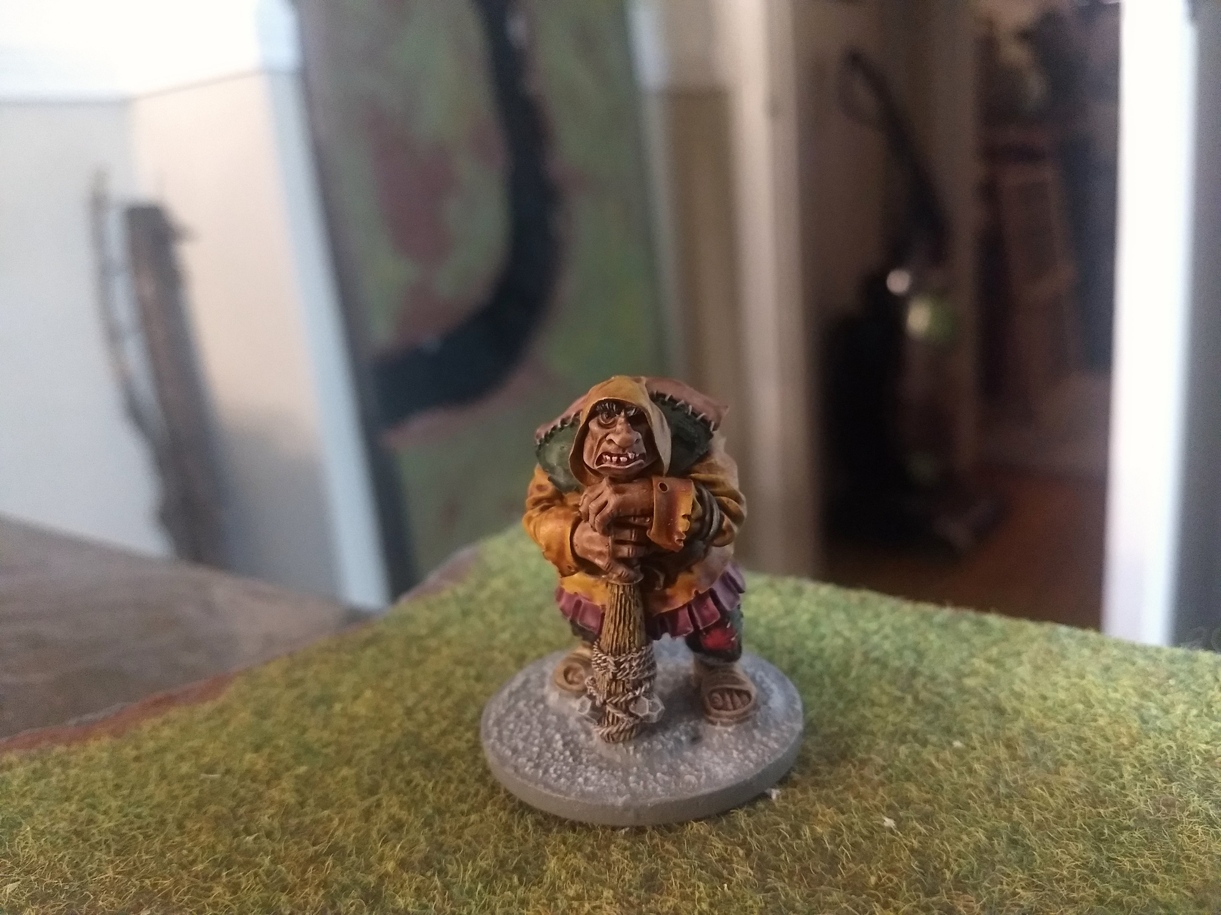
Here's some pictures of mini. I used the flesh Contrasts on. For these three dwarves I used just a small dot of Contrast on each face and then spread it out:

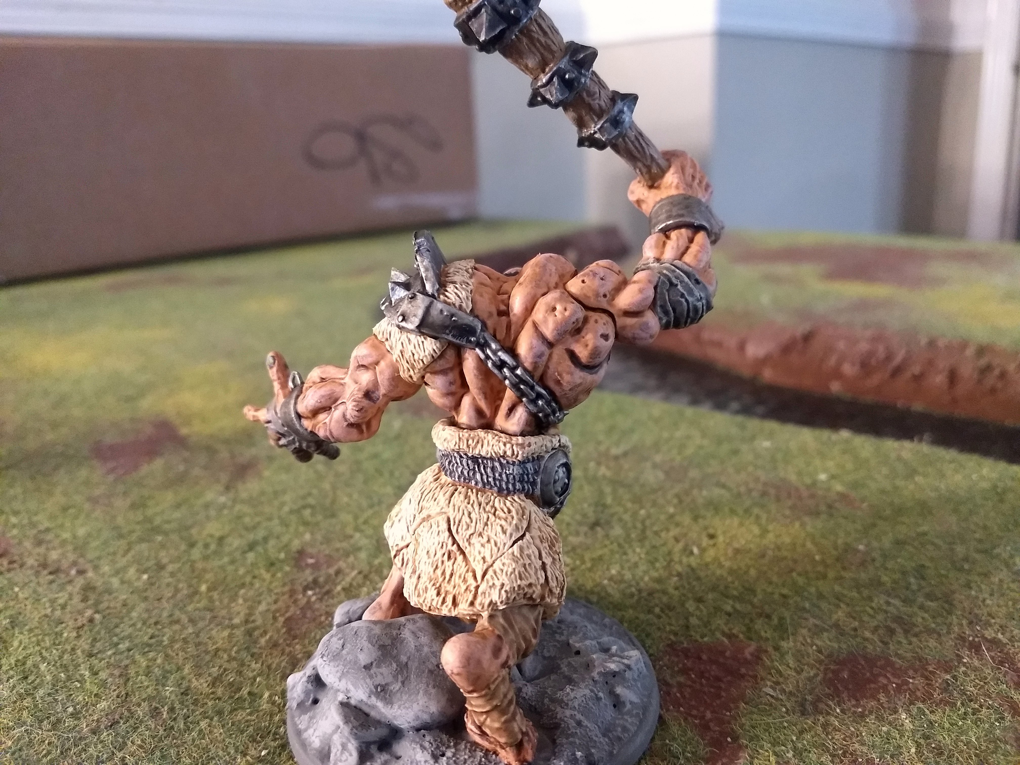
On this ogre, same deal. You get those nice, bright high areas and softly shaded recesses by using as little Contrast as possible and spreading it out:

This 3D printed Bilbo Baggins model is one of the largest models where I used flesh Contrast. This model is actually 100% Contrast colors. He's 54mm scale. For his face and hands I used a small brush and started by pushing Contrast into the crevives first and then using what was left on the brush to finish staining the rest of the surfaces:

One of the difficulties with the Contrasts is GW's hype about how you could just "slop it on" with a big brush and get awesome shading and highlting. Well, that's SORT of true, lol.

The problem is that certain colors are far, far stronger than others. Some of the darker browns and blacks are so strong that using them at full strength is takes a lot of practice. I tend to dilute them with Contrast medium so that they are not quite so strong.

Other colors like some of the lighter greens and yellows work spectacularly well at full strength.

Blues same deal, some of the darker blues tend to be very strong.

Some of the browns like Skeleton Horde and Aggoros Dunes are much, much lighter and weaker and can be used at full strength and give really good results.

Another issue is that the bigger the area you try to cover with Contrasts the greater the possibility of splotchiness and unevenness in color. Only way to remedy that is again to use less Contrast and be aware of any dripping and to lift it off the model with your brush before it has a chance to pool and dry in a clump. For example doing a model like a dragon or giant and using a flesh color on them is a challenge for the above reasons.

But no matter what the strength of a particular Contrast color is, it's always best to start out using as little as possible and then add more to a surface if needed.

Here's an other example of larger models where I used flesh Contrasts on the skin. This is indeed Dark Oath Flesh on these hill giants. You can see on these that the shading did come out pretty nice, but there is some splotches and some of the shading is a bit too strong. What I usually do is I add a dry brush highlight over a flesh Contrast to help soften some of the splotches. In this photo the models just have the initial coat of Dark Oath flesh, I haven't done any dry brush highlights yet:

Baranovich27 Sep 2021 3:20 p.m. PST

…had one more flesh example to show you. This was one of my earliest Contrats models I did back in 2019. This is a Reaper Bones hill giant primed in white.

This is Guilliman Flesh on his skin. This has a drybrush highlight over it to soften some of the splotchy areas. This came out pretty good but I still have to work on preventing some of the recesses being too dark:

Baranovich27 Sep 2021 3:20 p.m. PST

…also found this photo. These are some Frostgrave minis. that were among my very first attempts at using Constrasts.

These faces are Guilliman Flesh. It only took a very small dot of Contrast to cover the faces and fill in the recesses and crevices.

Personal logo Flashman14 Supporting Member of TMP27 Sep 2021 4:00 p.m. PST

I think a satin primer is the best for this – not super smooth, not super toothy.

I use the Citadel primers (Wraith Bone, and Gray Seer) and have a good collection of Contrast articles up on my Blog: link

Sample shot:

picture

Touching up the priming with the acrylic versions of those colors screws the foundation beyond repair. Make sure you prime properly and get underneath. Otherwise, there's very good advice above from Baranovich.

There is also considerable truth to the notion that these paints love textured surfaces – long, smooth, crease-free legs for example, often look bad.

robert piepenbrink Supporting Member of TMP27 Sep 2021 4:35 p.m. PST

Baranovitch and Flashman are wise in the Way of the Contrast. But I'd also be careful to thoroughly shake the bottle--and I'd get one of those 3D printed bottle holders. No other paint I've ever had gave me the grief I had with Contrast spillage until I got one. Those bottles are an accident waiting to happen, and not waiting very patiently, either.

Extrabio1947 Supporting Member of TMP27 Sep 2021 4:37 p.m. PST

Great information, Baranovich. Thank you for taking the time to put together such a helpful and informative post.

Baranovich27 Sep 2021 4:51 p.m. PST

Most welcome! Flashman, that's fantastic showing all three of the Flesh Contrasts side by side! Indeed, I agree about the primer. If in doubt, I always go with the GW Wraithbone and Grey Seer. Despite being expensive, they are among the best primers/underoats I've used yet.

Frederick Supporting Member of TMP27 Sep 2021 5:30 p.m. PST

Great posts and very helpful – many thanks Baranovich and Flashman – I have also just started using Contrast paints and I find that a couple of light coats work better than one heavier one

Also, would be interested to see what people think about the Contrast white – Apothecary White – I don't find it very – well, white

Extrabio1947 Supporting Member of TMP27 Sep 2021 6:09 p.m. PST

Flashman, you have a wonderful blog. I have added it to my favorites, and am looking forward to prowling through it.

it looks like a treasure trove of ideas, information, and advice.

Mirosav27 Sep 2021 7:19 p.m. PST

I have used various contrast paints with some success. The only flesh color I have used is Gulliman. To my eye it doesn't look right on it's own; I prefer either using it as a base and highlighting with a normal flesh paint or using the normal flesh first and using Gulliman to shade it.

Matamoros133727 Sep 2021 10:04 p.m. PST

YouTube link

He paints almost exclusively with contrast. It's worth to watch his technique.

Rusty Balls28 Sep 2021 4:58 a.m. PST

I have also been painting exclusively with contrast now for a while. My thoughts:

* a good primer is a must – these paints are all about surface tension and allowing the paint to flow. I use the GW primers despite being a little expense. They are very good primers. Also, the color of the primer WILL change the color so you need to plan for that, expect that, and use that to your advantage.

* The color set is limited and as mentioned some work great out of the bottle and some are way too dark. Don't be afraid to mix these with other contrast paints or the contrast medium to get the color you want. It's very easy. Mix only with other contrast paints or medium not water. I find the flesh tones too brown straight out of the pot so I mix in a little bit of the orange with Gillian flesh. I make zulu skin by diluting cygor brown with fireslayer flesh and contrast medium. If you paint historicals you'll want to learn this to make the colors you need.

* Again as mentioned, I love the way these paints spread. Learn to use that. I love the idea expressed about starting in the cracks and then spreading to the highlights. On the flip side, if you want to just get figures painted and on the table, these work very well and easy for that too. I have tripled my painting speed using these paint.

* These are not cheap paints. But if they work for you and you like the results then go for it. Same with the primers. In the end, it's a very small sum vs the money spent on all the other things to get a game on the table. Let it go, enjoy painting and getting great results with way less effort than the "pros".

* They are not fully pigmented paints so – you have to like the look vs standard paints. It works for me but you need to decide. You may find that some color are useful to you and others not to your liking. That's ok but take advantage of what you can.

Probably nothing very insightful that hasn't already been said but those are my thoughts and comments for what it's worth.

Beaky Nose28 Sep 2021 6:22 a.m. PST

Wow wasnt expecting so many replies thanks everyone. Especially Baronovich for taking the time to write all of that.

It kind of reinforces that I'm a bad painter as I just don't get results that look like that. I will try again, and maybe use a better undercoat. It might be they just aren;t going to work well for me.

Some of you guys are super talented painters!

tomrommel128 Sep 2021 6:38 a.m. PST

use the contrast medium or any other flow improver to thin the paints! I always thin the paints to a ratio of 50% contrast paint and 50% medium . I then reather paint a second layer of this mixture when the first one is dry then to get a very dark effect.

the above figure is painted in this way

Just a painter21 Oct 2021 8:04 a.m. PST

Thank you for this post and all of the input. I'm just getting started with the Contrast paints and this helps a lot.

Sorry - only verified members can post on the forums.