So in another recent post I shared my technique for painting a large piece of Tabletop World terrain with primarily Contrast paints and other kinds of transparencies like Tempera paints, etc.
I branched out a bit and thought I would try the transparency technique with some sci-fi stuff and see if I could achieve that smooth, crips industrial look and use some "cheats" and easy steps to do it.
In my third year of using Contrasts, I am now firmly entrenched in painting with transparencies. My painting has improved so much as a result. It's interesting because using transparencies is in essence like using thinned acrylic paints, at least to a certain degree.
What the Contrasts helped me to do is to develop a keen eye for light and shadow, and for knowing how to use which Contrasts over or under others depending on their particular strength and opacity. They are extremely valuable for creating those "glows" and "halos" around the right parts of the model to create that popping quality where everthing is surrounded by a separation of color from the adjoining detail.
Another reason I love the Contrasts is that I don't have the steadiest hands. I let the Contrasts do all the fine edging and outlining work for me! If elite and pro painters like the folks at the GW studio have the ability and skill to actually do edge highlighting and edging with actual paints and a tiny brush, god bless them!
I don't have that skill or steadiness. So I endeavored to achieve close to the same standard of painting but allow the liquid paints themselves to do the difficult job of separating detials with contrasting outlines and colors.
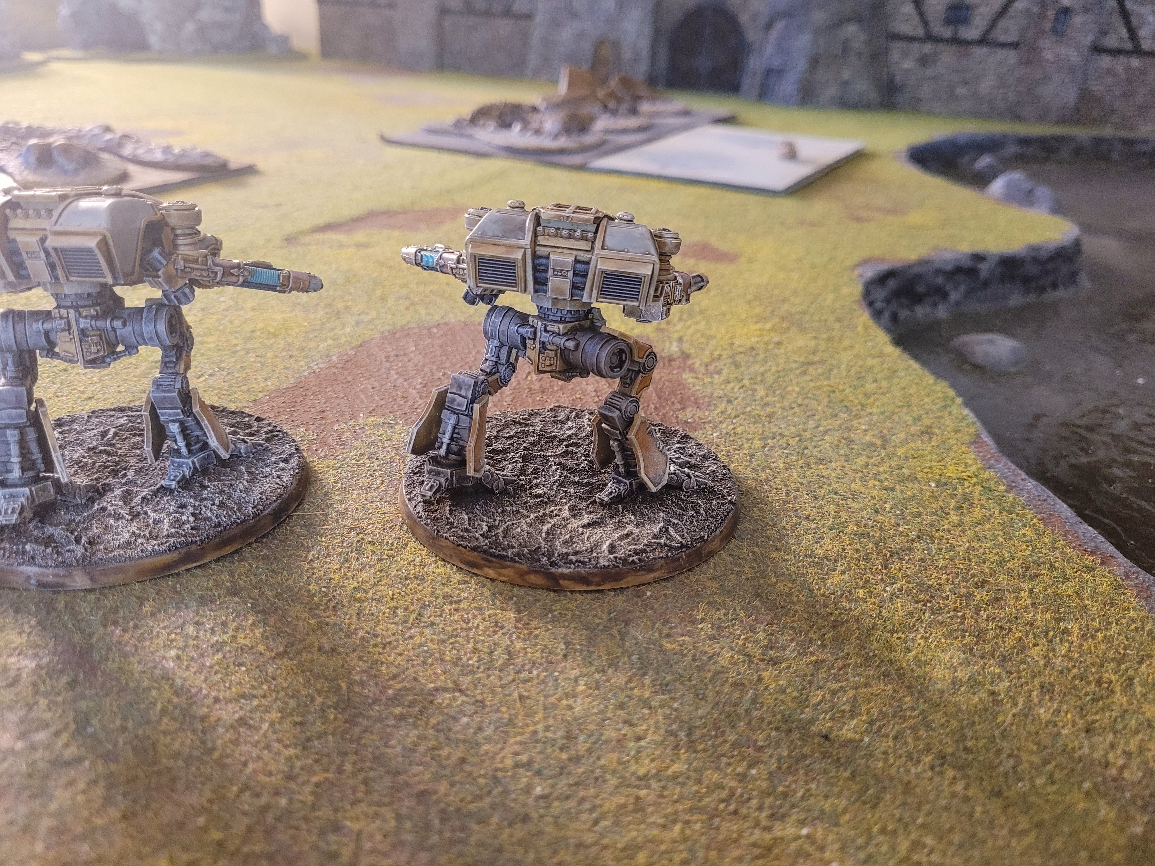
This is the result of speed painting two Warhound Titans for Adeptus Titanicus.
Folks, these were SO easy to paint! I can't tell you how forgiving the Contrasts are for getting perfectly into those rounded turns and recesses in all the inner seams of the armor plating. All those raised ridges around the armor plating would be an absolute nightmare to try to actually paint by hand and make it look halfway neat. All you have to do is push a Contrast color like Nazdreg Yellow here, push it right up to the inner seams all along the armor plates. What will result is absolutely perfectly and precisely outlined armor plates.
The same thing applies to complex details like logos and icons. Why on earth struggle with painting them with regular paints and trying to create fine edges when you can just use a Contrast to fill it in instantly?
There are only really four primary colors used to paint the majority of the Warhound Titans here. Nazdreg Yellow on some of the armor plating, Apothecary White on other armor plating, Ultramarines Blue for the icons, and then Skeleton Horde on the rest of the structural surfaces. The one color that I forgot to include in the photo is Basillicum Grey, which I used to coat what would often be done in regular silver metallic paint. I'm a big fan now of non-metallic metal effects. Basillicum Grey is the absolute perfect color for an n.m.m. greyish steel effect.
Once all the Contrasts were applied, it was a simple matter of doing an overall wash over the entire model with Agrax Earthshade, and when that was dry a light tan dry brush over the yellow and brown areas of the models, and then a white dry brush over the blue icons on the models, and then finally a light gray dry brush over all the gray metal areas.
The only "special" color I used was the Aethermatic Blue to create a glowing energy effect on two of the weapons.
And that was pretty much it. I feel pretty good that I can get sci-fi models to this standard and use insanely easy techniques and shortcuts. 95% Contrasts, a few tiny bits of actual mini. paint here and there, and I call it done!