| von Winterfeldt | 20 Aug 2021 6:46 a.m. PST |
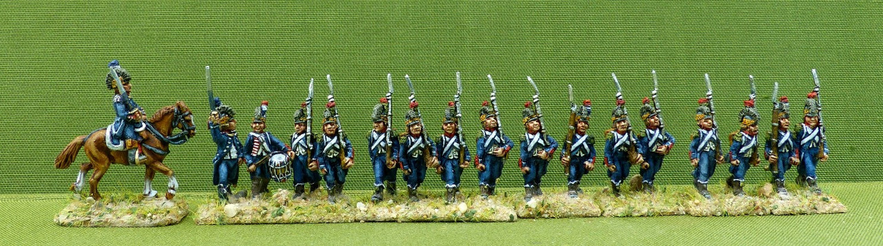
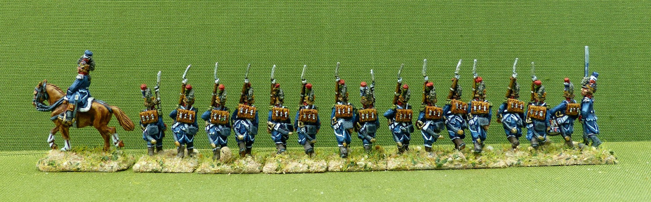
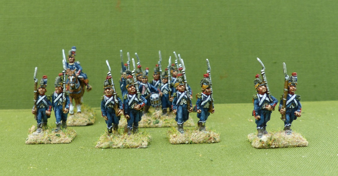
My first 18 mm with Contrast paints, for the faces, I used additional to the Contrast paints some conventional flesh and the white, as usual in the conventional way. I found 18 mm more difficult to paint with Contrast paints, but this just may be the lack of exercise. I am not that content with the horse, here I like my old way much better. The horse is AB by the way, the rest of the miniatures Sho Boki, French light infantry of French Revolution when the dark blue coat was introduced which re placed the original green ones of 1791. url=https://postimg.cc/r0cPPNbW]
url=https://postimg.cc/LYTbKZKW]
url=https://postimages.org/]
|
Frederick  | 20 Aug 2021 7:12 a.m. PST |
Nice work! Thanks for sharing – have been thinking about trying the contrast paints out |
| jabbadabbadan | 20 Aug 2021 8:09 a.m. PST |
They look great. No matter how you paint them, they always look Great. |
 deadhead deadhead | 20 Aug 2021 1:21 p.m. PST |
Yes, that was my thought. However you do them they look great. You could pick up a set of child's crayons and they would beat anything we can do. I bought the recommended sprays and some contrast colours for horses but, like you, I was not convinced. Quicker but not quite as good as traditional style. Now abandoned. |
| SHaT1984 | 20 Aug 2021 2:33 p.m. PST |
As the lads say, wonderful work H-K.
Even the subject matter is evocative of a most underrated gaming period, regards davew |
| repaint | 20 Aug 2021 3:48 p.m. PST |
They look very good. If I were you, I'd paint the uniform, head gear and flesh with contrasts and most details with regular paints. My guess is you can cut your painting time by 40% |
| Zeelow | 20 Aug 2021 4:45 p.m. PST |
|
| Redcurrant | 20 Aug 2021 4:49 p.m. PST |
Very nicely done, as has been said before, you always make the figures look great. |
| rick32 | 20 Aug 2021 7:14 p.m. PST |
What contrast blue did you use for the uniform? |
| takeda333 | 20 Aug 2021 10:08 p.m. PST |
Nice work. Well done! I have some Republican and Gender forces in 18mm and love the period. Thank you! |
| von Winterfeldt | 20 Aug 2021 11:50 p.m. PST |
As for the blue, I use a mix, I have only Contrast Leviadon Blue and Ultramarines Blue, those I do mix. Also in case I don't like the hue I add artist water colours, as like from Schmincke – till I aquire the desired result. In case the paint is not creating too much contrast one can add a bit water and or Contrast medium. Dark blue is not that easy to apply. |
| Oberlindes Sol LIC | 21 Aug 2021 9:09 a.m. PST |
|
Sho Boki  | 22 Aug 2021 3:05 a.m. PST |
Painting is great as usual, but imho the earlier way of painting looks better.
But for first try the result is splendid anyway. It will be improve in future. |
| von Winterfeldt | 22 Aug 2021 6:28 a.m. PST |
thanks for your feed back Sho, but what looks better horses, yes no discussion about that – but what else? Colours, yes – not as vibrant but overall result – quite pleasing and cutting down considerable painting time. Let me know what you liked better in old style?? |
| Sho Boki | 22 Aug 2021 12:06 p.m. PST |
Yes, missing vibrant is first visible thing. Also the tone of blue is different than in previous photos, but blue is very insidious colour of course and this tone looks even more frenchy..
Another thing, I noticed, was less sharp contrast of shadows than earlier. Particulary on the faces. It is only visible in the big photos you sent me, not in these small ones here.
Barely noticeable and not a problem or wrong but when used colours claimed to be the "contrast" ones then the opposite could be expected. You said that you used for faces and belts your usual paints. I understand that you painted them over "contrast" paints? Because a little blur occurs exactly there in dark shadows where supposedly one type paints ends and anothers started. "Contrast" paints isn't dark enough, I suppose. |
| SHaT1984 | 22 Aug 2021 1:24 p.m. PST |
>>Because a little blur occurs exactly there in dark shadows where supposedly one type paints ends and anothers started. "Contrast" paints isn't dark enough, I suppose. That kind of multi-'shading' effect isn't bad actually. I have done it deliberately myself- leave the undercoat black on edges of belts and just whiten the centre stripe- makes effects much easier, though precise stripe is needed!
Just IMHO of course, d |
| von Winterfeldt | 23 Aug 2021 6:23 a.m. PST |
Sho, thanks for your feed back, highly appreciated Another thing, I noticed, was less sharp contrast of shadows than earlier. Particulary on the faces. It is only visible in the big photos you sent me, not in these small ones here. Yes indeed, but you can click – right click on the photos here to see them enlarged. But yes due to technique – the sharp contrast of the shadows is a victim of using White Primer
then
Contrast Paints In the old days I sued White Primer
Heavy wash / glaze of dark violet or natural umber
Block painting of basic colours – sparing, not overpainting the deep recesses.
The artist water colours as a glaze and taking off highlights with wet brush. So I could cut out two steps – I have to evaluate is it worth to do the old way or is the new way a good compromise which enables me to paint miniatures much quicker. |


")