| Baranovich | 12 Apr 2019 11:24 a.m. PST |
I realize that for many of you a topic like this is very old and ho-hum and isn't anything new, been around forever. But for me I had this kind of revelation when I finally for the first time ever in my gaming life painted 40k stuff. The ironic thing is that me following GW's tutorials over the years is precisely one of the reasons I got better at painting and at recognizing things such as correct color value combinations for layering, highlighting, shading, etc. Aspiring to attempt to paint at their studio level was something that genuinely did help me get past painting plateaus and advance in my level of painting skill. But with regard to GW's 40k space marines my admiration for their studio paint jobs actually turned to irritation and then even mild anger the more I thought about it, lol. Obviously GW photographs their stuff at high resolution, and VERY, VERY up close for their books and adverts. When I looked at how they perfectly edge highlight each and every piece of space marine armor and add pin prick reflections on the tiniest things, even their helmet eye lenses I realized that this was for nothing except the very purpose of being able to photograph their stuff an inch away and to show a pretty sales pitch. To photograph models as close as GW does, you have to do ridiculous levels of eyesight-destroying detail work, I get that. For me it wasn't even about reverting to a "lower" standard of painting or stopping at "tabletop standard" vs. something better or more carefully painted. It was about recognizing overkill and not falling victim to it. Yes, there are many talented painters out there who DO actually achieve what GW achieves, hats off to you! and it looks absolutely amazing. I'm not saying there's anything wrong with making them that beautiful. But for me it was about the idea that everything in GW's 40k world looks new. Yes, they do some weathering and some slight, slight grunge washing, but for the most part their marines always look perfectly colored, fresh and shiny new. And I can't stand that. What I think what GW misses sometimes, no actually misses a lot of the time is that they are so busy making their space marines look like masterpieces that they forgot to make them actual soldiers. GW is so busy showing off their paint palette and techniques that they forget what it actually is they're painting. Case in point:
These guys look like a perfectly colored cartoon fighting amidst dusty ruins. The Primaris are TECHNICALLY very beautiful paint jobs. But they are also insanely hard to replicate in my own painting and also are an aesthetic that can only be described as "hyper-display" level. They are too pretty. Same goes for the chaos space marines. Too busy showing off the paint palette and too busy being studio models. Same goes for this standard bearer. Too clean, and the GW contrasting color of the helmet thing is becoming my bane. The white helmet is out of place here. Too much "color coding" going on:
Contrast those photos with some of the Primaris I recently did: link
link
link
link
link Same thing happening with the Apothecary. This is an amazing paint job but he's ridiculously clean and pristine. And why do they feel the need to have the field medic be in WHITE armor? Unless you want him to get shot first, lol:
I did mine in the same, dull bluish gray as the rest of the army and I think it simply looks better than GW's: link Same thing with GW's Repulsor Tank. Again, very pretty:
In the 40k universe, we're told that this armor and equipment is produced in the millions, mass production on a staggering level, to equip millions upon millions of soldiers across a thousand planets. One would think that to produce stuff in those vast quantities for endless war, it would be produced as simply and quickly as possible. With as little insignia or embellishments as possible! GW's models look like NASCAR vehicles and drivers covered in advertising patches. My Primaris tank does have several insignias like GW's (although I believe GW puts on additional ones on other areas of the tank if I'm not mistaken), but mine is far dirtier and grittier: link I painted my Primaris with the idea that this gear is mass produced like our government produces military uniforms. And these armies are fighting like any people would, with the thought of practicality and survival in mind. The whole "mass-self sacrifice/suicidal charge for the good of the Imperium" thing…yeah, yeah I get that. But still, wouldn't soldiers want to at least try to extend their survival and life? That's why I only used one insignia on all my Primaris on one shoulder pad. On some of them I used the dark blue emblem instead of the white to show that some soldiers might want an emblem that didn't stand out as something to aim at. Those white curved emblems are like a bulls eye for the enemy to shoot at. Only solution for the soldier is to remove it entirely or get it modified or painted over. The armor itself, you would think much of it would be heavily weathered and faded, given all the harsh environments and atmospheres they operate in throughout the universe. I abandoned all the careful edge highlighting technique that GW uses and went for a base color of Macragge Blue that was heavily drybrushed overall, to the point where the marines' blue has faded almost to a pale grayish color. Kind of like how Union army Civil War uniforms faded from blue to a faded out pale kind of grayish blue after being out in the elements for a time. The weapons I think would be an overall single color or mostly so, like the mass produced M-16 or other military rifle. All black rifle and all black clip seems very practical and realistic. |
| williamb | 12 Apr 2019 11:38 a.m. PST |
Photoshop and computer graphics? |
| Aethelflaeda was framed | 12 Apr 2019 11:39 a.m. PST |
How much of the paint jobs were retouched in photoshop? If the end product is marketing images, I would not be any more surprised when the actual figs are not as pretty in reality than I would when you might see a playboy model that looked nothing like her photos in the flesh. |
nnascati  | 12 Apr 2019 11:39 a.m. PST |
Absolutely in agreement. I have painted a lot of GW for a client, and I try to give them a more in service look. I have always felt though, that the painted images we see, and this applies to all manufacturers, are of the 3. Ups, not actual game size minis. |
| Baranovich | 12 Apr 2019 11:45 a.m. PST |
I agree about the photoshop aspect of it! I have always wondered how much of GW's photography is actual painting and how much is indeed a photo editing program that they can add in minute details with! The comparison to a Playboy model is right on the money. An airbrushed centerfold often looks so different in the real world that the woman isn't even recognizable. Not trying to take away anything from the efforts of GW's studio painting team. But some of the details they manage to capture on a model that small really does seem impossible to achieve with paint brushes. |
| Oberlindes Sol LIC | 12 Apr 2019 11:48 a.m. PST |
In the distant future, materials will always look perfect because dirt, blood, ash, and whatever else won't stick to it. There will be a super-Teflon to keep everything clean and shiny. Laundromats and car washes will go out of business. Insignia won't be painted on armor or embroidered on fabric. Insignia will be integral to the material itself. Fabric, such as standards, will be made of artificial substances like advanced polyesters, possibly including nanites that can change colors to create various insignia. Contrasting helmet colors will be forbidden. I should note that I don't actually play 40K, although I have a fair amount of 40K stuff picked up at flea markets and integrated into the relatively near far future of Traveller, only about 3,500 years in the future. My painting reflects that everybody wears practical camouflage and everybody gets dirty. |
| magical monstrous steve | 12 Apr 2019 12:01 p.m. PST |
The in-universe reason why space marine armor looks pretty is that, while these items might be mass produced, they are cared for by legions of serfs/slaves and also get meticulous quasi-religious attention from their owners.
The real world explanation would be that, over the past several decades, GW has realised that shiny sells. |
 20thmaine 20thmaine | 12 Apr 2019 12:07 p.m. PST |
In the distant future people who spend £10.00 GBP or more on a single figure will paint them just the way they want to… Or to put it another way – the WH40K is a colourful fantasy, not a realistic hard SF. |
| Baranovich | 12 Apr 2019 12:12 p.m. PST |
@20thmaine, Yes but GW's 40k lore is always talking about battling across vast wastelands and vast areas of dusty, bombed out ruins and cities. I can't figure out how they would stay so colorful and shiny in those environments. I get what you're saying about it being colorful fantasy but to me that directly clashes with the world and lore GW is trying to convey. Don't get me wrong – it's their conflicting aesthetic I'm criticizing, not your post! :) |
| Torquemada | 12 Apr 2019 12:30 p.m. PST |
@Baranovich: Stop trying to apply real-world concepts to 40K … it never works :-) In general, I agree with you, but shiny sells … and looks good in glossy mags and hi-res images online. As for Photoshopping their stuff, I imagine they do "some" minor colour balancing, saturation, etc. adjustments before publishing, but so does anybody who publishes product images. However, from what I've seen in RL at GW Nottingham and on CMoN & Dakka, I doubt very much that they need to Photoshop details. You mention lens highlights. Doesn't everybody add lens highlights? No? |
| 20thmaine | 12 Apr 2019 12:36 p.m. PST |
@Baranovich – I do get your point. The only other explanation I can proffer is that prior to battle the Spacemarines give each other a good dusting off, and buff each other's armour up with Mr Sheen. |
| Baranovich | 12 Apr 2019 12:44 p.m. PST |
@20thmaine, Fair point: they are marines after all and so maybe in between battles there is a hyper-strict code of maintenance and upkeep on armour and equipment. When they're not fighting they are either training or cleaning. That I can see as being plausible…and letting GW off the hook dangit! (lol) |
| Baranovich | 12 Apr 2019 12:48 p.m. PST |
@Torquemada, Yes, I do lens highlights but only on lenses that I deem to be big enough where you can actually pick up on the highlight from tabletop height, or maybe a little closer. The Primaris Repulsor has two large lenses mounted to its laser cannon that I did reflection effects on but only because those actually "pop" in a game setting. I also did some subtle lens reflections on the Apothecary's double lens thing he's looking through. But for the trouble they took to put on you barely see them unless you're looking at the model at the tip of your nose, lol. For space marine helmet lenses, a tiny white dot or comma on the lens is a sufficiently nice effect but one that I personally consider a case of diminishing returns if you take my meaning. But I'm not going to deny they are a nice touch when done neatly over eye lenses. |
| Moonbeast | 12 Apr 2019 1:06 p.m. PST |
All apothecaries are white, it's laid down in Girlyman's codex. The only chapters whose apothecaries aren't white are those whose primary chapter colors are white aka White Scars, White Consuls etc. Techmarines are always red, to honor their training on Mars and the Mechanicus. The white helmet on the ancient denotes a veteran. The colors all have meaning. And just fro the record, my Salamanders and Black Templars have been campaigning a long time and have chipped armor and mud and even blood spattered on them. |
| robert piepenbrink | 12 Apr 2019 1:43 p.m. PST |
Uh, guys? You're discussing the consistency of a backstory written and illustrations published entirely for the purpose of selling overpriced SF toy soldiers. When you arrive at a consensus on this, are you going to debate the new line of He-man figures next? Any time the story comes first, I'll cheerfully argue the internal consistency of the story and the fidelity of miniatures to that story. But in the grim dark future which is Games Workshop, there is only advertising. |
| 15mm and 28mm Fanatik | 12 Apr 2019 2:00 p.m. PST |
+1 robert The fluff and backstory serve the plastic crack GW is trying to push, not the other way around. People look at the pristine, brightly colored (and maybe even Photoshop-enhanced) eye-candy and tell GW to
They are less likely to do that if the pictures display dirty, battle-damaged figures no matter how well painted they are professionally. It's a subliminal cue-based response. Don't overthink it. |
| Otto the Great | 12 Apr 2019 3:53 p.m. PST |
I think your miniatures look great. GW is selling their paint system; Base coats, washes, and trademarked colors, all explained in the White Dwarf. It's "the hobby" and their marketing. I take what I like and use it the way I want to. |
| 15mm and 28mm Fanatik | 12 Apr 2019 4:42 p.m. PST |
Baranovich, If you need to feel better about your painting skills, look at the staff-painted miniatures and models on the Forgeworld website instead. They're more down-to-earth and less Golden Demon. |
| Mithmee | 12 Apr 2019 6:24 p.m. PST |
You have to realize that for many of their stuff they have some top quality painters (I.E. Pro's) doing the work. True we love to see great painted mini's but while practice does improve your own work, what they do for those miniatures for their photo shoots is spending hours to days on just one miniature. |
| billthecat | 12 Apr 2019 6:41 p.m. PST |
…What Robert Piepenbrink said… I do agree with the OP, though… I think that the more weathered/utility approach and less cartoon-colors (neutralized) makes the models appear more like soldiers and less like glossy adverts… grimdark shouldn't look like hello-kitty… or warfare like a polished sporting event… My happy medium for painting has always been somewhere in between, as a little extra contrast is needed for miniatures (very small things, generally viewed at 12-36").
As far as the viability of the actual advert paint jobs… a non-issue as most folk would never consider that level of detail/invested time for a gaming piece… these are display models, not game pieces. I think most of us have figured out that we can't or won't execute these kinds of paint jobs, despite what may be on the glossy pages/boxes etc… I would love to get my hands on some 3-up GW sculpts, however…. (but not at GW prices….) |
| Lion in the Stars | 12 Apr 2019 7:59 p.m. PST |
I'm also aiming for a much more 'in the middle of the battle' look for my marines. But my Tau are very bright and clean. Napoleonic French colors, actually. For them, I am assuming that the armor and uniform doesn't let mud stick to it, so they are always parade-ground perfect. |
| skippy0001 | 13 Apr 2019 4:23 a.m. PST |
Scrubbing Bubble Grenades-every Marine has them. |
| joedog | 13 Apr 2019 7:12 a.m. PST |
I always rationalized it as the bright armor is the "dress"/"parade" version, and that a much more subdued/camouflaged version would be worn on campaign. Back in the RT days, illustrations showed SMs with camouflage and variant uniforms based one where they were fighting. It's possible that they could even have a feature from "The Forever War", where the armor has a chemically reactive skin that allows the user to set the color at will. Having served in the military, I've seen both how personal uniforms in garrison are kept to an exceptional standard of "perfection", and how field equipment – particularly that which is issued to different people at different times – gets worn down and beaten up. Another way of looking at it is a knight at a tournament vs. a knight on campaign. I will sometimes paint a colored up SM, as a "parade ground"/"recruting poster" guy, but most of my SMs tend to be dirty and worn looking – I think it is a much better, more realistic look, and it is also much easier to paint. ;) |
| Baranovich | 13 Apr 2019 7:26 a.m. PST |
Good discussion everybody. So yeah, I fully realize that GW has to market their stuff like any company does so of course you want your stuff to look as pretty as possible when you're pitching it. I wasn't seeking to justify or validate my painting skill level in any way. I definitely paint for gaming first but strive to make them display worthy as well. So it's an "upper middle of the road" approach. I'll never just paint something in base colors and game with it. More than anything, I think one of the reasons you see so many primed, unpainted or half-painted minis. for sale on Ebay is because of that very same marketing. The pretty pictures initially excite you into buying the minis, and GW's work is done. Sale is made. They could care less whether you let your three year old kid paint them with finger paints or even if you don't paint them at all. They sold you the dream so to speak, now you're left to navigate all of the motivational and skill hurdles to attempt to produce an army that accomplishes that tabletop popping quality. For me with the Primaris I had to find a way where I could achieve that dream on the tabletop, but not fall victim to losing motivation and dropping out because of comparing my army to GW's studio perfection. I think I figured out a way to make my Primaris models when massed on the table top to "pop" at like maybe 70% to 75% of what GW achieves. But do it in a way where it's not as advanced as 'Eavy Metal photography. Basically, making space marines look more field-ready, weathered and dusty means you won't win any painting competitions any time soon. But when collectively on the tabletop they may actually look visually superior and better (i.e. more realistic)than GW's photographed hi-res masterpieces. |
| Moonbeast | 13 Apr 2019 9:35 a.m. PST |
"When you arrive at a consensus on this, are you going to debate the new line of He-man figures next?" The new Skelator sucks, just sayin". |
| Baranovich | 13 Apr 2019 9:58 a.m. PST |
@Moonbeast, I'm not sure if you are trolling or not, lol. But why such irritation? If my painting philosophy about the Primaris irks you that's totally cool. So simply don't subscribe to it. I'm not trying to arrive at a consensus at anything, and I'm not trying to win a unanimous agreement on anything. I'm also not debating anything. I'm merely describing my own personal painting approach to the space marine aesthetic and why I chose it. Doesn't mean it's the ONLY way or the absolute right way. My hope is that some gamers may find some value in my approach and may find things in my painting approach that helps them as well, that's all. Jeez, why do these topics always have to attract such cynicism and anger? These are miniature DISCUSSION forums after all. A place where you start up topics and people talk about them, you know? |
| Moonbeast | 13 Apr 2019 12:22 p.m. PST |
@ Baranovich No irritation on my part.You honestly sounded like you wanted an explanation on why the armor was a specific color or why the helmets were painted a specific color. My marines are dirty, paint yours how you wish. I like the muted colors you used, I have always thought the Ultramarines were way too bright. I was jokingly replying to Robert, sort of.I probably should have added a smiley. And they are re-releasing the He-Man figures, and I think they're terrible.:) |
| Hades wolf | 14 Apr 2019 12:01 a.m. PST |
Well I have decided to go the whole-hog with my new Shadow Spear Vanguard Marines, nice camo green armour, urban camo cloaks (if I can paint it) and no chapter badge etc, just armour numbers and a bit of art in places. Sans Colonial Marines. Also no skulls (unless I add them) and lots of extra pouches etc. To this force will also be added some scouts (old metal) and new plastics and some lovely black op snipers from Anvil miniatures as Sternguard marines. Plus a couple of land speeders and a land speeder storm. A Camo Rhino and I must get a Vindicator, just because I love the models. Almost sensible Marines, possibly? Glen |
| 15mm and 28mm Fanatik | 14 Apr 2019 12:00 p.m. PST |
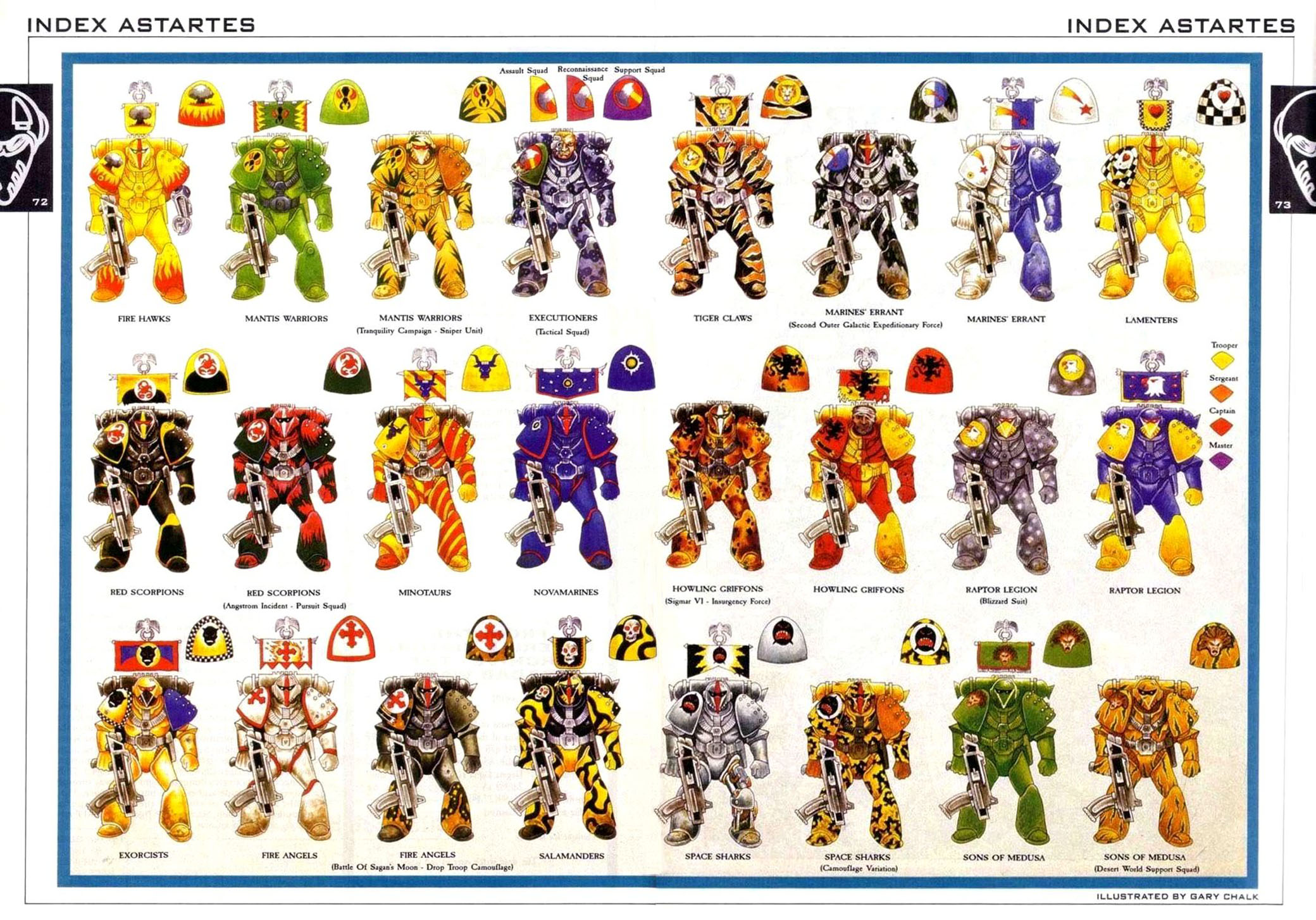
Here are some GW "sanctioned" SM camo schemes from back in the RT days:
Granted, they're still not very practical or effective in the real world sense but coolness trumps utility where marketing is concerned. |
| 15mm and 28mm Fanatik | 14 Apr 2019 12:28 p.m. PST |
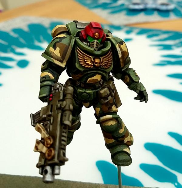
Here's a nice example on a Primaris Marine. A reason camo isn't popular on smooth armor is that you lose much of the depth and three-dimensional effect compared to unicolor schemes with proper shading/lining/washing/highlighting. It's also why we only see camo mostly on the non-armor (i.e. cloth) parts of the Astra Militarum:
|
| Hades wolf | 15 Apr 2019 8:57 a.m. PST |
That's why I am going for plain camo green armour and just using camo on the capes etc 😁 |
| Aethelflaeda was framed | 15 Apr 2019 10:52 a.m. PST |
I prefer the camouflage every time. A 3D figure creates its own shadows and highlights in any case. |
| Lion in the Stars | 16 Apr 2019 7:02 p.m. PST |
Skippy for the win! 
My Primaris Marines are getting painted in the RT-era Marines Errant camo, which happens to look a lot like Luftwaffe Splinter:
Even if that does make them Sons of Gullible/Papa Smurf. @Hades wolf: makes sense, I think that's why the Colonial Marines had green armor over camo fatigues in the movie.
A 3D figure creates its own shadows and highlights in any case. But not as big/dark as they would be if it was a full-size object. It's one of the things that the plastic modeling crowd 'borrowed' from the gamers. If you paint your camo using really thin paint (I'm talking orange juice thin), you can pre-shade the model and paint camo over that to get the appropriately dark shadows. I'm not going through that much effort. Primed red-brown, hitting all the joints with dark gray (to wash black later), then using a stony gray for the next part of the pattern, topped with VMC Reflec Green and some fine lines from micron pens. |
| chromedog | 17 Apr 2019 5:45 p.m. PST |
In the original RT rulebook cutaway on the armour, it noted that it had a programmable mimetic coating – it could be set for "parade dress", combat, camouflage, etc.
This was when they were brainwiped criminals repurposed into His Imperial Majesty's fascist butt-kicking bully-boys. The "armour painting" thing came later, when they morphed into crusading space knights and his most august majesty's agents of policy enforcement. |
| alpha3six | 18 Apr 2019 1:21 p.m. PST |
The precise edge highlighted look was developed during the tail end of first edition 40k, before "modern evil GW". Just look at the box art of the MKVII metal/plastic boxed sets that were released between 1991- 1993. That look is absolutely achievable on actual 28/32mm miniatures – whether you feel it's worth the time and effort is another matter. I really don't understand why people get upset. They're your figures – paint them however you want. If you guys prefer to use camouflage and muted colors, by all means go right ahead. The lore is expansive enough to accommodate chapters that use camo by default. If you feel that 40k could/should have officially developed into a gritty military SF setting, you have had more than 25 years to get over your disappointment and move on. Also take a look at the Horus Heresy community's preference for giving their models a weathered and battle-damaged appearance. When you take a brightly colored tank painted in "parade" colors, and then subject that fancy tank to realistic damage and weathering (using military scale modeling techniques), the result is nice and dramatic. Personally I have a Word Bearers Horus Heresy army with dark crimson metallic armor which is weathered and chipped in an effort to emulate the Word Bearers shown in the color plates of the Heresy campaign books. I hardly ever use any edge highlighting. |
| joedog | 21 Apr 2019 9:18 a.m. PST |
Since I am evidently not internet savvy enough to post pictures here directly, here is a link to where some pics of some of my "camo" and "subdued" SMs. link |
| alpha3six | 22 Apr 2019 11:27 a.m. PST |
|