"Foundry late war field grey" Topic
5 Posts
All members in good standing are free to post here. Opinions expressed here are solely those of the posters, and have not been cleared with nor are they endorsed by The Miniatures Page.
In order to respect possible copyright issues, when quoting from a book or article, please quote no more than three paragraphs.
For more information, see the TMP FAQ.
Back to the Painting Message Board
Areas of InterestGeneral
Featured Hobby News Article
Featured Link
Featured Ruleset
Featured Showcase Article
Featured Workbench Article Making terrain can be quick and inexpensive.
Featured Profile Article Need larger bases for large models or dioramas?
Featured Book Review
|
Please sign in to your membership account, or, if you are not yet a member, please sign up for your free membership account.
| Mikesy59 | 29 Nov 2017 5:58 a.m. PST |
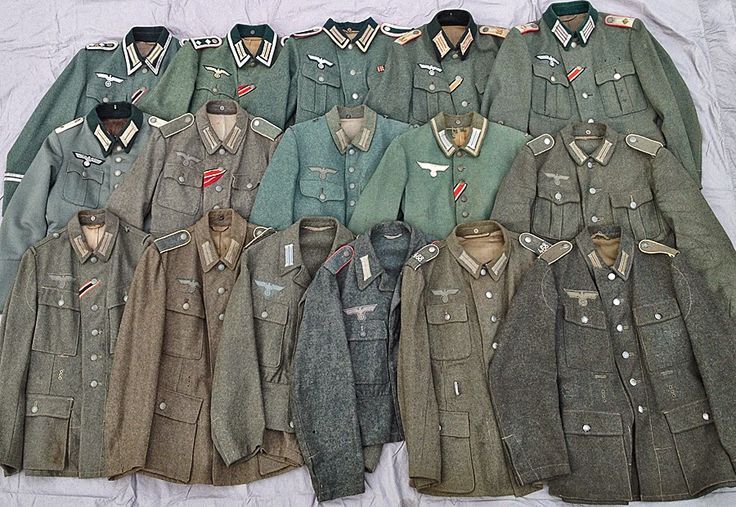
I've just started using some Foundry late war German Field grey. I bought the 3 colour system. It looks like a very light slate grey with no hint of green at all. I've done some research, but can't see any uniforms this shade. Have Foundry got it wrong? |
| PrivateSnafu | 29 Nov 2017 11:11 a.m. PST |
I think there was a lot of variance.
There is one grey one in there. I do think it should have some green. I'm on the other end of the spectrum thinking the Vallejo color looks too green without enough grey. |
| Mikesy59 | 29 Nov 2017 4:07 p.m. PST |
It's as I suspected clearly a range of different dye lots being impacted by wear and tear. Thank you Private Snafu. I'll be adding some tone over the grey. |
| jdginaz | 30 Nov 2017 11:24 a.m. PST |
Interestingly the two tunics in the center (second row #s 3 and 4) aren't of the combat type. On the third the buttons too close together and the pocket is a interior type. The same for the buttons on the 4th but it also has no pockets, also the nazi eagle is rather large and there is no detail in it. The 4th looks somewhat like a Waffenrock but the collar is wrong and there is no waffenfarbe and there is that odd breast eagle. The first tunic on the center row also has the buttons too close together like on a waffenrock. |
| Mikesy59 | 23 Apr 2018 8:03 a.m. PST |
I'm currently painting some early war Germans and I'm using the foundry early war field grey which to my eyes appears a little too blue. I've not put the highlight on yet, but I'm not sure that will make much difference. Currently toying with the idea of applying a green wash. I've researched this quite intensively and although I know there were very wide uniform colour variations, I still think it's a little too blue. Has anyone else found this? Any advice much appreciated |
|