| dpowell | 28 Feb 2017 2:35 p.m. PST |
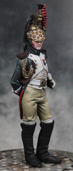
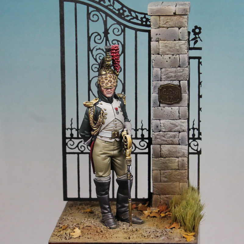
Here's a display figure from Pegaso that I've been working on, an officer of the Empress' Dragoons. He's not quite done yet, I still need to do the epaulets, rest of the braided cord around the arm, his boots, and add the sword/scabbard. But, he's pretty closed to being finished, so I thought I'd share. Figure is painted entirely in acrylics.
|
| Gen Custer | 28 Feb 2017 3:30 p.m. PST |
That is absolutely amazing. Brilliant and effective looking edge highlighting too ;-) |
| dBerczerk | 28 Feb 2017 4:40 p.m. PST |
Very nice. I look forward to seeing him in front of the rest of the squadron. |
| ccmatty | 01 Mar 2017 6:07 a.m. PST |
Wow. That is book-publishing quality and deserves to be in a book on how to paint miniatures. Great job. |
| Dr Jeckyll | 01 Mar 2017 7:16 a.m. PST |
Holey Smokes! Your Good!!!!! |
| setsuko | 01 Mar 2017 7:43 a.m. PST |
Really nice! And I love pictures of larger scale minis like this as reference when I try to figure out how to paint 28mm napoleonics. Great! :) |
| rob polymathsw | 01 Mar 2017 8:07 a.m. PST |
Wow…incredible. Really really nice…looks amazing! |
| von Winterfeldt | 01 Mar 2017 9:10 a.m. PST |
looks great, just wanted to comment that the boots need some more shading, but I read that you still have to do them. The metallics look very impressive – looking forward to see the end product, certainly a collectors item. |
 deadhead deadhead  | 01 Mar 2017 3:18 p.m. PST |
I do know that everyone will ask this… and it is usually about shades of green too…so I will ask what you used for the green. It is "not at all bad", here for my second favourite unit of the era (never yet done well in 28mm) Great thing about the boot shading is showing before and after. These pictures I will save, to teach me. Superb work obviously! For 6mm, just incredible…. |
| von Winterfeldt | 01 Mar 2017 11:36 p.m. PST |
question : the miniature shows parade dress, the helmet should be highly polished, you chose however quite a battered look – which I would like for campaign wear and tear, but for a parade – the servant of the officer would have polised it without problems to a fine sheen. |
| sukhoi | 04 Mar 2017 2:06 p.m. PST |
Excellent all around! The turban is amazing! |
| dpowell | 06 Mar 2017 2:23 p.m. PST |
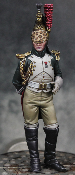
Thank you, everyone! Deadhead, for the green on the coat I used a Dark Green from Badger Minitaire's line of paints. The brand isn't important, but some dark greens have a satin sheen which I wanted to avoid. For shading, I mixed in some dark purple (Burgundy Wine from Reaper paints). The result shouldn't look purple, but it produces some more interesting shadows than just mixing in black. For the highlights I mixed in a grey. This serves to desaturate the color while also making it lighter. If I used a white or a light green, it would make the coat look lighter overall. With grey you get highlights while keeping the overall look of the coat to stay a dark green. Of course that works hand in hand with only applying the highlights in small areas. Hopefully that helps! Keep reading, I've got more on the boots for you in a second. Von Winterfeldt, I think part of that could be the lighting for the photos. Those lights are more head on, which don't show off the metallic helmet as well. Under an overhead light (as the figure will most likely be seen in person), the helmet shines more clearly. I will take another look at it though in person to see if I can brighten it up. Here's an update with the figure almost finished. I still need to finish the left boot (right now it's just a sketch), add the sword, and paint the base. But otherwise he is just about done
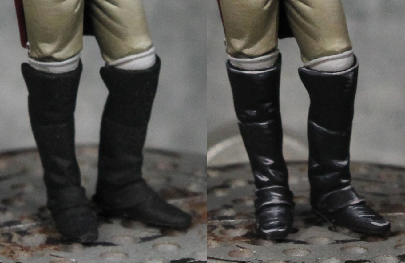
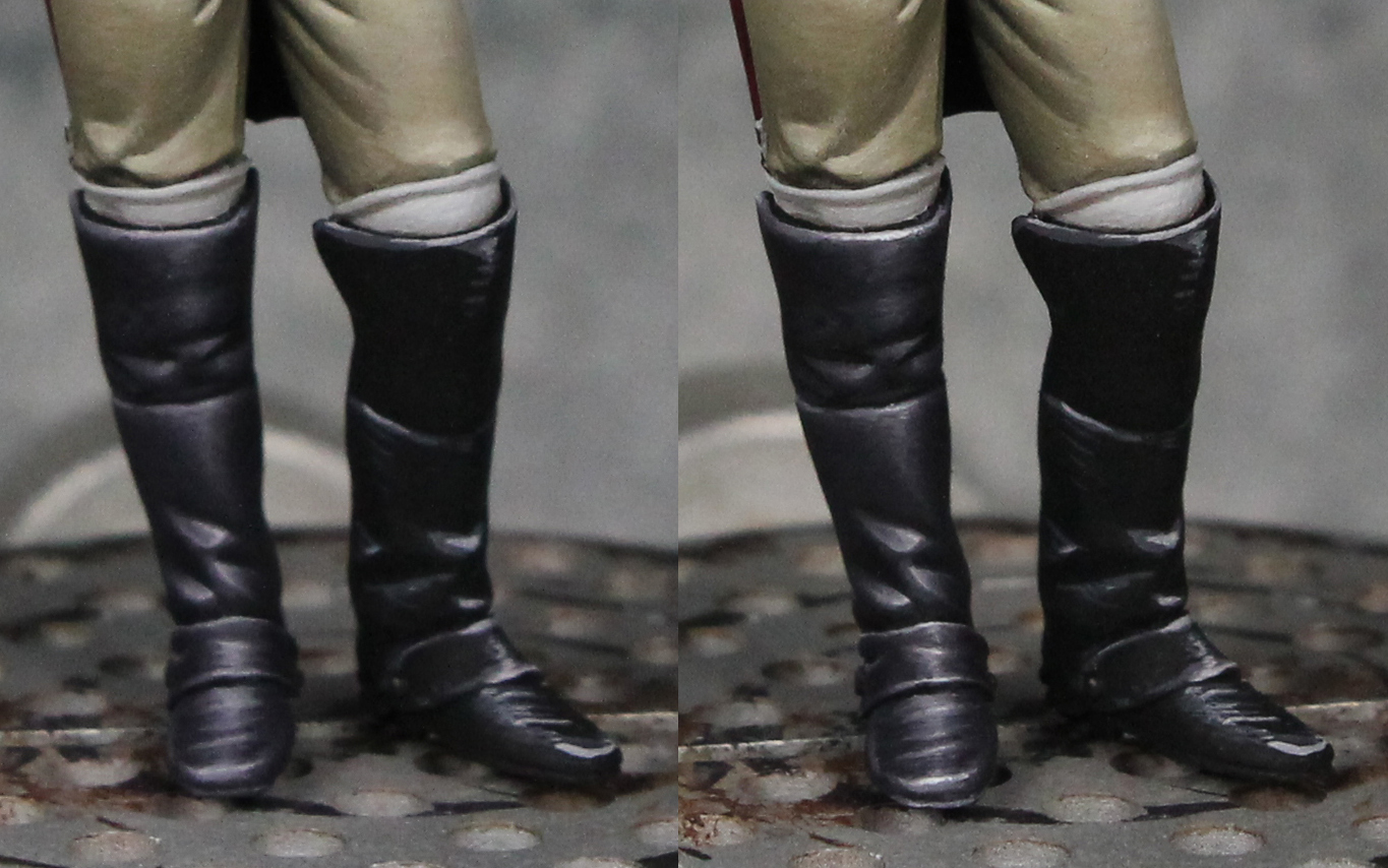
For the boots, I put together a short write up on my painting blog ( link ). I'm in the process of writing a more detailed tutorial, but you can find the short version there. Here's a close up of the initial sketch for the lights. Then with that blended back down into the black and lastly the final white highlights added.
|
| deadhead | 06 Mar 2017 2:29 p.m. PST |
Oh those boots…not a varnish….pure highlights! That is the skill of an artists who can create 3D or the sheen of metals onto a flat canvas. The green is fascinating. I just know that adding white does not work…..grey to desaturate….of course! Purple is intriguing for the shadows. But I am saving the pics of the boots above all |
| dpowell | 06 Mar 2017 2:41 p.m. PST |
Thanks, Deadhead. Yeah, gloss varnish never quite looks right to me on the small scale. I've started to wonder what if I did painted the boots like I showed but then also applied a gloss varnish over it. Could produce interesting results… or terrible ones. Maybe one day I'll experiment and see which! :) Yes, the grey into the dark green is a useful tip. You can experiment with what shade of grey. A dark green + medium grey and dark green + light grey will produce slightly different looks. By the way, I've used the same trick with Dark Blue. Works great there too. |
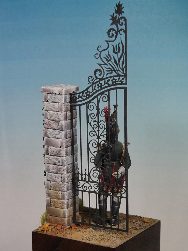
| dpowell | 15 Mar 2017 1:09 p.m. PST |
Nearly done with the figure. Just working on the scene for him. Once that's done and he's permanently attached to the base, I'll add the sword/scabbard he's resting his left hand on.
|
| von Winterfeldt | 16 Mar 2017 6:20 a.m. PST |
thanks for explaining, incredible effective shading and highlighting |
| deadhead | 16 Mar 2017 10:04 a.m. PST |
The gates? Photo etched brasswork I guess….great basing to complement your painting work. Actually, one negative thought. What surface is he actually standing on? Is it intended to be gravel eventually? Ah, just reread, he is not yet attached to the base…..forget it! This will be great |
| dpowell | 16 Mar 2017 11:06 a.m. PST |
Thanks, von Winterfeldt and deadhead. Yes, the gate is photo etch. I got it this site: scalelink.co.uk
They've got a lot of accessories, mostly for trains, but do have some neat photo etch. They've got some similar stuff in 1:76 which might work for the 28mm figures in case anyone is interested. I'm actually in the process of trying to decide what to do with the ground. I thought I could do something like a white gravel. But there is already plenty of white and light grey between the figure and the column, so perhaps I should just go with a light brown dirt look for the ground. I've done some Googling to look at Chateau gates and see examples of both gravel and dirt. Sure those are modern images, but neither strikes me as unrealistic for early 1800's. I'm open to thoughts and suggestions of course! Finished some more of the stones. Only 5 left on the front, but there is still the entire rear of the column to do.
|
| deadhead | 16 Mar 2017 11:43 a.m. PST |
Totally agree. Right now the poor chap looks like he has stepped into ready mixed concrete. A pale brown, with highlights will totally lift the base and give a great contrast. I was very tempted to get some Scale Link stuff as a background for my Mameluke Band. Now convinced for future 28mm project! |
| dpowell | 17 Apr 2017 10:43 a.m. PST |
I wrapped up this Dragoon the other week. Here's how the piece turned out:
|
| deadhead | 17 Apr 2017 12:57 p.m. PST |
The leaves….I just love touches like that. Autumn leaves. Delighted to see this finished |
| Bill Slavin | 18 Apr 2017 7:30 a.m. PST |
So beautifully done. Thank you for this! |
| 18th Century Guy | 22 Apr 2017 9:09 a.m. PST |
Awesome work. If you live or travel to the Atlanta area the figure club here, atlantafigures.org , would love to have you join us. Also, we have a show every February and your work would be very welcome.
Thanks for sharing. |
| archiduque | 25 Apr 2017 8:02 a.m. PST |
|
| dpowell | 25 Apr 2017 12:45 p.m. PST |
Thanks, everyone. 18th Century Guy, I have wanted to get out for that show at some point. Unfortunately I'm in the Southern California area, so it's quite the trip. But hopefully one of these times I can make it out. |


")