| HarryB1961 | 01 Jun 2015 11:59 a.m. PST |
I don't wish to re-start a debate on which paint to depict french uniform blue. What i'm interested in is your views on whether said blue should be portrayed dark, dark blue as in reality or much lighter blue to take into account the relative affect of scale. Also the shade of blue is greatly affected by the lighting conditions ie a more realistic dark blue looks fine under display lighting but appears black in day light. What are your views on reality vs scale affects on colour shade ? |
 deadhead deadhead  | 01 Jun 2015 12:01 p.m. PST |
I guess first question is………what scale? Museum uniforms for French Nap or ACW Union are almost black………but that is 1/1 scale. |
| HarryB1961 | 01 Jun 2015 12:17 p.m. PST |
Yeah deadhead that's exactly it, but what balances does everyone make for scale ? My chosen scale is 28mm and i've seen everything from sky blue to almost black blue. Is it just a case of what you're personally happy with or is there an official artistic way of adjusting shade with scale ? |
| Supercilius Maximus | 01 Jun 2015 12:55 p.m. PST |
Almost all dark blue uniforms in the French army of this era were dyed using indigo, and when new at least were the near-black very (very) dark blue that you see in surviving examples and/or reconstructions in museums. How dark you want to make it on 28mm figures is up to you, but it would have faded in a similar way to ACW Union uniforms, so the advice above is sound:-
A lot of the problem with "colour interpretation" for French uniforms seems to stem from the use of watercolours by some artists, which is a difficult medium in which to represent the darkness of the indigo dye (or to reproduce light and shade effects if you do). That and the rather unfortunate Osprey MAA on French Light Infantry which some wargamers seem to have taken as licence to invent their own shade of blue for their French infantry. As far as I am aware, the British/Portuguese used teh same method, and so did the Prussians ignore any crap (on here or elsewhere) about "Prussian blue" which existed neither in name, nor in chemical form (it's not a natural dye), at this time. Part of the fun of Napoleonic wargaming should be accidentally confusing dark-coated French and equally dark-coated non-French troops on the tabletop, as happened quite often in real life. |
| MajorB | 01 Jun 2015 12:58 p.m. PST |
|
| Esquire | 01 Jun 2015 1:21 p.m. PST |
I use a dark blue and then highlight with a medium blue to show contrast and depth -- a very dark blue just shows so little of a 28mm figure. Yes, that involves some brush work. If you are going to paint just the one color, I would avoid a blue that is too dark. I do use Vallejo Dark Prussian Blue and then highlight with Prussian Blue. |
Ligniere  | 01 Jun 2015 1:25 p.m. PST |
My collection of French 28's has grown over the last fifteen years.
I'm of the opinion that my lads are on campaign, not on parade, and that their dress should reflect that circumstance.
So, over the years I've happily used different shades of blue, from multiple paint manufacturers, to represent my various battalions. Most recently I've tended towards darker shades, and have also taken to the dip method, which makes the colors even darker. These contrast strongly with some of my earlier units, both in painting style and color. But, it doesn't bother me, they're on campaign. Some coats are new, whilst some are old and faded. |
| Garde de Paris | 01 Jun 2015 1:27 p.m. PST |
I use Americana (acrylic) Navy Blue for my French in 28-30mm, and for my Prussians in 15mm. It seems exactly like the Humbrol French Blue of years ago. Very happy with this color. But then I always feel a three-dimensional wargame figure provides its own shading as well! Old school to the hilt. GdeP |
| Dogged | 01 Jun 2015 2:10 p.m. PST |
Dark blue with some dark violet ink. French indigo uniforms fade to a dark blue with a distinct violet hue instead of just blue, dark blue or grayish blue. Photos usually don't quite show it. Dark blue should suffice.
Examples:
|
| Timmo uk | 01 Jun 2015 2:22 p.m. PST |
I paint mine dark blue, nearly black like the real thing. I've never subscribed to the notion of painting them brighter lighter blues. To me they don't look like Napoleonic French if they aren't in very dark blue. I also don't really get the notion of making them 'pop!' on the table. I think this stems from the fact that a lot of wargames terrain is too dark so it follows that brighter figures stand out. Well yes they do but if the terrain was made to be more realistic in it's colouring then darker figures look more like the real thing. The thing is with the popping paint business is that to me it seems to only applying to jackets and plumes that get the over bright treatment. At the end of the day each painter makes their choice but with such a wealth of re enactor images and museum pieces (real or replica) it's easy to get it right if you want to. I saw French style line troops the other day painted in a mid-bright blue and I wondered what nation or germanic state they were. It came as a bit of shock to me to read that they were an artistic interpretation of French. One other thought to agree with what's been written above, these dark French coats would not weather to a lighter, brighter shade, they would tend towards a greyish tone with a slight violet cast. Same thing as blue jeans they might get less saturated in colour but they don't get brighter as the dye is washed from the material or fades. I paint the similar dark blues for 28mm and 18mm. I suspect I put a slightly heavier wash over the larger figures but only by a subtle amount. |
| Gunfreak | 01 Jun 2015 2:42 p.m. PST |
I use french blue triad from foundry with slight highlights of a blue i can't remember. Its to light for the real thing. |
| HarryB1961 | 01 Jun 2015 3:27 p.m. PST |
Very interesting views guys. Supercilious Maximus, you're point re artists hit home as i recently purchased Napoleon's Army 1790-1815 showing the artwork of the great Lucien Rousselot. Even allowing for variations for modern printing the colours of his 'french uniform blue' are staggeringly varied and although they are prints look nothing like the blue worn by those photographs of re-enactors. It's also interesting to read indigo would weather greyish |
 Flashman14 Flashman14 | 01 Jun 2015 3:36 p.m. PST |
Fade to navy blue. Not the sky blue I see everywhere. I'm with Timmo UK, minus the conciliatory language. Everyone should get to be a bastard about one thing. I choose this. Otherwise I'm quite agreeable. |
| HarryB1961 | 01 Jun 2015 4:02 p.m. PST |
Timmo uk/Flashman14, may i ask your views of the Dalimore/triad style of painting ? I'm an old returnee painter and can't get my head round the modern trend for multi coloured stripes on figures. Maybe this is why i'm having issues with my painting, back in the day french troops wore dark blue, period ! |
| stoneman1810 | 01 Jun 2015 4:11 p.m. PST |
The best paint set I've found is the "Blue Paint Set" by Andrea Color. There are 6 shades – 1 base color, 2 progressively darker shades and 3 progressively lighter shades. Here is a sample painted with these colors (AB 18MM).
Best Regards, John |
| huevans011 | 01 Jun 2015 4:41 p.m. PST |
Dark blue. Humbrol 104 mixed with a lot of black. And use very light cream for the white bits. Not pure white. |
| Dan Beattie | 01 Jun 2015 5:01 p.m. PST |
John Stoneman1810: That is spectacular painting. Are all your miniatures painted to that standard? |
| stoneman1810 | 01 Jun 2015 7:50 p.m. PST |
Dan – yes I try to paint everything to this standard. I am actually not a wargamer – just a painter and collector. I have a very small personal collection and I do sometimes paint for others. I've been painting for over 50 years. I just posted some more of my work under "Grenadiers a Cheval 2 scales" – on Napoleonic discussion and Napoleonic Gallery. Thanks for your kind compliments! |
| Flashman14 | 02 Jun 2015 5:31 a.m. PST |
I generally like Dallimore/triad. I don't always stop at three and I often incorporate other techniques along side. I layer dark to light but try and blend in each gradation. flashman14.blogspot.com |
| britishlinescarlet2 | 02 Jun 2015 8:11 a.m. PST |
I have a similar style to Flashman14. Dallimore works for me as long as it is under control ans there is blending involved….. |
| 4th Cuirassier | 02 Jun 2015 12:03 p.m. PST |
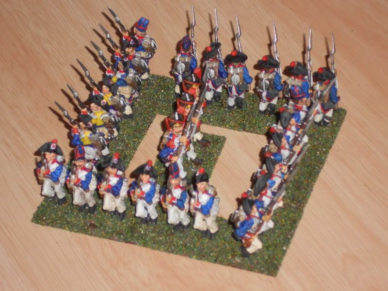
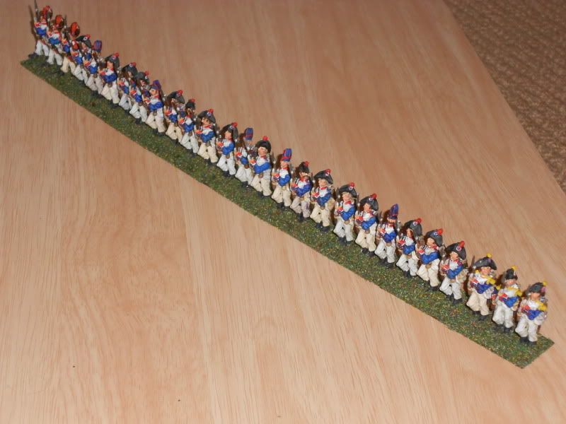
I'm an old returnee painter and can't get my head round the modern trend for multi coloured stripes on figures. +1 This style of painting can easily make the figures look cartoonish, which some sculpts often are to begin with, it must be said. I wonder if it is to do with making them photograph well? This unit that I painted
is much darker in the metal than in those photos, which have also washed out the white highlights. Based on the samples above I'm going to make my future French a lot darker still though. In fact I will probably disperse the figures from that battalion among the others. Generally I prefer to make colours paler though, based on my experience a few years ago. The shade of "dead salmon" paint (yes, that was its name) we chose for an outside wall looked darkish pinky grey on the sample card but in daylight on an outside wall it instantly paled to off-white. These Afrika Korps guys were dry brushed with white looking down on them from above to try to make them look blasted with sunlight. They need more of a blast I reckon.
|
| HarryB1961 | 02 Jun 2015 12:56 p.m. PST |
As usual on TMP, a wealth of information, thanks guys. Supercilious Maximus, re your point on the fun of napoleonic wargaming takes me back to the film Waterloo and the scene late in the day when Rod Steiger after looking through his telescope asks a younger officer " is that French blue or prussian black ? " I think that sums up your point and the whole post perfectly ! |
| Supercilius Maximus | 03 Jun 2015 6:16 a.m. PST |
Funnily enough, I had that scene in the back of my mind when I posted – though not for quite the same reason. An early wargaming opponent insisted that the Prussians all had black uniforms "because Napoleon said so, in the film". |
| Zargon | 03 Jun 2015 8:15 a.m. PST |
Just finished 70 odd froggies for a mate doing Waterloo in a couple of weeks time (one of those multi games with about 5000 odd figures in 28 mm affairs :o he was short a few units- only??:-) I used dark blue (americana Prussian or something like that blocked in the colours for everything put secret sauce wash over it all hilight pick up on the obvious white over ivory, carmine over flat red etc (Vallejo paint here) just to pep up the details left the blue with wash as is, they looked (doing a Smoky here :) dang good when satin vanished and flocked, posted the lot of to him this afternoon. That dark blue with wash at 28 mm worked well with brighter red and ivory/white.
Cheers so long short dark Bleu ;) |
| Edwulf | 03 Jun 2015 8:41 a.m. PST |
In 28mm id go for a dark blue, but I'd just do a normal blue in 6mm. You have to exaggerate the vividness of the colour at 6mm though or they all start to look the same.. |
| HarryB1961 | 03 Jun 2015 9:30 a.m. PST |
Secret sauce wash ???? Zargon please explain |
| Tyler326 | 05 Jun 2015 5:43 a.m. PST |
The blue the French used, just as the red the Brits used, faded over time. Especially in the field. I use a medium or dark blue, then highlight in a lighter shade to bring out the high spots. Stick with the drabber colors of blue. You can even mix shades to give a more realistic presentation of "fading". |
| matthewgreen | 09 Jun 2015 10:54 a.m. PST |
My understanding is that indigo dyes aren't affected by sunlight, as some dyes were. So any fading with time would arise from the dye washing out, through rain, etc (they wouldn't be laundered). So that would mean more of the grey fabric showing through, a bit like jeans. I remember reading in Elting that indigo dyes became scarce and quality fell off, with some uniforms looking sky blue. I guess this this might have arisen from using the dye in low concentration or from a poor quality source. If so the effect would be similar to ageing. Elting gets quite a bit of criticism these days too, and I don't know what primary evidence this was based on. Also worth pointing out that, according to Wikipedia at least, Prussian Blue had been invented by this time, as the first chemical pigment, though that name may not have been in use. What I don't know for sure is whether it had got beyond printing into use as a dye for uniforms. It is common currency to suggest that Frederick the great used it for uniforms, but I'm unaware of any hard evidence for this. Also I understand that scale effects of colour are a bit of a myth too. What is true is that colour look very different in different light conditions and contexts. So what looks right on a war games miniature on the table may not be a faithful representation of the colour itself. I'm often drawn to reflect that the challenges faced by wargamers can be quite similar to those of artists. That so many artists have rendered French uniforms lighter than accurate, so that they can get more texture is often what we end up doing. |
| HarryB1961 | 10 Jun 2015 9:52 a.m. PST |
That's brilliantly put matthewgreen. Time and time again ive heard arguments whether french indigo will/won't fade to grey (good 80's record if anyone remembers ). So to depict highlighting, in theory, should be greys to suggest worn clothing devoid of dye rather than lighter and lighter blues which often gives french troops a 'fantasy' blue look ? |
| McLaddie | 10 Jun 2015 9:22 p.m. PST |
Elting gets quite a bit of criticism these days too, and I don't know what primary evidence this was based on. I think that is the primary reason for the criticism…if you'll excuse the pun… While each army had 'requirements' for color composition in uniform dyes, remember this is government work going to the lowest bidders…or simply those available at the time and place. I remember reading about one British regiment in the Peninsula that received new coats. Shortly afterward they crossed a deep stream. They emerged from the waist high waters with coat tails that had turned pink. It isn't any wonder that Wellington didn't require proper uniforms, only that they could be distinguished from the French. Having said that, I can imagine French uniforms being dyed with indigo, Prussian Blue or any other 'blue' dyes, depending on circumstances, where campaigning could create all sorts of shades. |
| Timmo uk | 26 Jun 2015 3:33 a.m. PST |
"Timmo uk/Flashman14, may i ask your views of the Dalimore/triad style of painting?" The full blown version with a black undercoat and black lines around every area is not to me. It looks too cartoonish. However, the method of layering lighter colour over dark has worked for me. However, I mix all my colours as I prefer to chose them than rely on the paint manufacturer to produce a colour straight out of the pot. I paint with a white undercoat so never have any issues with coverage of colours like yellow or red. This method enables me to paint in the darkest tones I want first, so in that respect I do build up layers but my tones don't start from black. It just looks too crude when I've tried it some painters pull it off but many don't and the figures have a deadness about them. Black undercoat is great for silver/white metal colours but if you are painting figures that have any amount of white or yellow it's probably the worst start you can give yourself as the black instantly creates problems and work. If you are returning to painting I'd suggest you try a few different makes of figures and try black, white and grey undercoats and see how you get on. A black undercoat is more forgiving of mistakes than white but ultimately the latter gives you more options as you progress through painting the figure. For example, there are some areas where I want the dead effect that a black undercoat gives to the colour e.g. weapons. It makes them look solid but for fabric it never convinces me. Uniforms were usually made of wool that has warm undertones. By putting in your own localised undercoats you can get the different contrasts between solid items and clothing. Although AWI these figures show this approach. As can be seen I don't use the high contrast style of Dalimore. I think that style developed as it worked with the cartoon like proportions of the Foundry figures but it's not the only way to paint wargaming figures. It photographs well but I just like something more subtle. The other advantage you'll get working over white is you can control the hue and tone of the paint better. White slightly brightens the colours but you can compensate for that when you mix colours. Black dampens everything and to me it forces your hand as you then have to paint the whole figure fighting the effect of the black. If you can paint accurately the benefits of the black hiding areas into very dark shadow doesn't come into play. To me nothing looks worse than pale colours delineated by black lines. YYMV. I suppose I find white undercoat allows you to be more experimental but a black undercoat with Foundry Triads is more of a painting process that some feel comfortable with. The blue in all of these images is lighter than the figures really are but not by much. The F&D AWI are the true colours of the models. The AB figures are a bit brighter than in reality. F&D figures painted over white undercoat.
[/URL] AB over white undercoat. Headswap done by a good friend of mine.
[/URL] Weathered blue (figure is darker in reality)
[/URL] I painted this figure about ten years ago. It was an attempt at really campaign scruffy look. The jacket was painted to look totally weathered a washed out greyish blue.
[/URL] |
| Marc at work | 26 Jun 2015 5:29 a.m. PST |
Go to a decent army surplus and look at the colour variations on modern kit, then try and pretend that all French uniforms were the same… |
| Jemima Fawr | 26 Jun 2015 10:09 a.m. PST |
Woad was also used by the French as a local 'war austerity' alternative when indigo imports started to dry up due to British naval interdiction (after they'd trialled white uniforms in 1807). Woad apparently faded quite greenish and wasn't that suitable, though was sometimes all that was available. |
| matthewgreen | 26 Jun 2015 10:26 a.m. PST |
If you want figures as nice as the ones shown, I'm sure black undercoat is the wrong way to start. But if your focus is quantity – especially of smaller figures (15mm down) then black (or other dark colour) has a lot going for it. The figures come to life with a bit of judicious contrast. If the figures look like dark masses from afar, then that is hardly unrealistic! Having said that a combination of dark undercoat and dark quickshade has made my Prussians look a little too dark! Though dark is how many artists portray them. |
| bc1745 | 26 Jun 2015 11:55 a.m. PST |
FFS sacre Blau! Now ask about the bricole……. followed by the origins of the croissant… And what happens to France when the workers at the white flag factory go on strike……….. Sheesh….. |
| Jemima Fawr | 26 Jun 2015 12:12 p.m. PST |
Chris, What's your problem? |