MrHarold MrHarold  | 06 Feb 2013 2:31 p.m. PST |
Hi All, I put together an insignia/logo for my merc/pirate force:
I was wondering if anyone else would like a logo/insignia for their force? I'm working on learning Illustrator and having projects always helps  If you would like one, just post to this thread, and any background, or ideas would be helpful! E.g. "They ride lions and live in the forest". I'll post them up as JPGs, but if you really like yours i'd be happy to e-mail a png or svg file, or whatever! |
BlackWidowPilot  | 06 Feb 2013 2:42 p.m. PST |
Sure! To begin with, there's my generic "Imperial Terran Marine Corps" insignia consisting of a white skull and crossbones with "MARINES" below it. The skull and crossbones are BTW more along the lines of the one found on the tail fins of various Valkyrie veritech fighters from Macross, rather than a cartoon style. The logo is in a solid block style font. Then there's the eight-pointed gold compass star and victory wreath insignia of the Terran Empire itself. I've also used a ten-pointed red star in the past by overlaying one Soviet red star decal over another. Edged in yellow this could make for a fetching neo-soviet starship insignia IMHO… Leland R. Erickson
Metal Express
metal-express.net |
| MrHarold | 06 Feb 2013 2:59 p.m. PST |
How about these: Imperial Terran Marine Corps:
Terran Empire:
|
| Gasmasked Mook | 06 Feb 2013 3:14 p.m. PST |
I have been meaning to knuckle down and generate some decent insignia for my various forces but since you are offering, I humbly offer my own ideas: EUROFORCE – the traditional twelve stars of the European Union with an eagle in the centre (the eagle features in just about every piece of military iconography in Europe so it is not as Roman/German/French/Polish-Lithuanian Commonwealth-centric as it first sounds)
Example -
UNANTCO (United Nations Anti Nuclear Terrorism Commission)- the globe/existing UN symbol with the Damocles sword suspended above it. My major difficulty with drawing this one is coming up with a colour scheme and style that doesn't make the UN look puppy-kickingly evil.
Neither are particularly original ideas but, hey, most real life logo aren't either. I also need to come up with pretentious latin motos for both organisations to spin around the edges but that is a thought for another day. |
| BlackWidowPilot | 06 Feb 2013 3:15 p.m. PST |
Not bad at all, Mr. Harold. I'd probably have had the skull a bit less banged up (ie., more teeth showing) and the letters straightened up, but your rendering does convey the basic message of the ITMC ("If you can read this, we've already killed you…").
Leland R. Erickson
Metal Express
metal-express.net
|
| MrHarold | 06 Feb 2013 3:55 p.m. PST |
A re-do marines:
And EuroForce
Still working on the UNANTCO and one for The Wild Ducks |
| clkeagle | 06 Feb 2013 5:04 p.m. PST |
I've only come up with one so far. The setting is the Conquest System, a massive triple-star system with many terraformed planets and moons. This faction is the Conquest Development Center, one of the three megacorporations that control nearly every aspect of the system (with a specialization in weapons technology).
-Chris K. |
| MrHarold | 06 Feb 2013 5:18 p.m. PST |
|
| MrHarold | 06 Feb 2013 5:27 p.m. PST |
|
| MrHarold | 06 Feb 2013 5:59 p.m. PST |
And an updated one for the Crimson Hegemony:
|
| MrHarold | 06 Feb 2013 6:00 p.m. PST |
I really like your's Chris… I like the triangle shape! |
| clkeagle | 06 Feb 2013 6:21 p.m. PST |
Thanks, MrHarold I've been kicking the upside-down triangle around for that faction's "creative ancestors" since I was 15. :) Changing that particular setting into a single three-star system gave me the last idea I needed to finish it. I love the alien font on the Hegemony insignia. The spider-shape alone might look neat as graffiti. Now I'm inspired to round out the other factions in the Conquest System. Here's the start of Beakon Industries. They're the second of the three megacorporations specializing in energy research. But it feels like it's still missing something… any of you artistic types have any ideas?
-Chris K. |
 Rebel Minis Rebel Minis | 06 Feb 2013 6:36 p.m. PST |
Oooh, I ma going to need some of those! |
| Mooseworks8 | 06 Feb 2013 6:50 p.m. PST |
Very cool. Have nothing yet for my 6 and 15mm forces but I have a cheesy logo for my sub-Ultramarines Space Marines chapter. The Knights of the Ordo Malleus: The Storm Hammers
|
| MrHarold | 06 Feb 2013 7:12 p.m. PST |
Oooh, I ma going to need some of those! Titan Marines!
Brog Empire!
Shular!
|
| MrHarold | 06 Feb 2013 7:33 p.m. PST |
I like that logo wargamer1972! I think it looks very well done! As for the Megacorp Logo Chris, maybe some rays on the silver shield coming from the bottom up might make it pop a little more? I like it, but if you think it's too plain  |
| clkeagle | 06 Feb 2013 7:59 p.m. PST |
MrHarold I'll have to tap you for my alien factions. :) Good call on the rays… time to add some "majesty," as Strong Bad would say. @Mike here's my contribution:
-Chris K. |
| clkeagle | 06 Feb 2013 8:12 p.m. PST |
Update: didn't like that font. At least not on that logo.
-Chris K. |
| MrHarold | 06 Feb 2013 8:14 p.m. PST |
That's really cool! I really like that earth force logo. I really like how the moon is on it too. |
| clkeagle | 06 Feb 2013 8:18 p.m. PST |
Can't decide what layer I want the moon on. :/
|
| MrHarold | 06 Feb 2013 8:22 p.m. PST |
I'd probably do it all the same color, almost like a black stroke. |
| clkeagle | 06 Feb 2013 8:26 p.m. PST |
Maybe in front of the globe instead of behind?
|
| clkeagle | 06 Feb 2013 8:31 p.m. PST |
I'd probably do it all the same color, almost like a black stroke. Like this?
I do like that better. |
| MrHarold | 06 Feb 2013 8:34 p.m. PST |
I think that's my fav… looks great |
| clkeagle | 06 Feb 2013 8:40 p.m. PST |
Okay, need to put the Earthforce logo away for a bit. The third megacorporation in the Conquest System is the Aurora Group. As with CDC and Beakon, they have their hands in everything from foodstuffs to toys to military hardware. But their specialization is, well, is creating poor quality knock-offs of CDC and Beakon goods and selling them to planetary governments at bargain prices.
-Chris K. |
| MrHarold | 06 Feb 2013 9:13 p.m. PST |
I like the tapestry look with the sci-fi looking font. Very nice.
Another one:
Mutant Q | 06 Feb 2013 10:03 p.m. PST |
I've been kicking around the idea of "national" insignia for my Hypatian Solar Union forces: A stylized figure of a human woman in Roman clothing holding a scroll aloft with outstretched hands. Behind her is a laurel wreath and at her feet is a banner with the motto, "For the many and the few," in Latin. Sadly I lack the software and the artistic skill to realize it. |
| MrHarold | 06 Feb 2013 10:07 p.m. PST |
|
| Sargonarhes | 06 Feb 2013 10:23 p.m. PST |
The Kra'Vak's Black Division
All Kra'vak members of this war band would have this insignia mark on their forehead. |
| Mutant Q | 06 Feb 2013 11:18 p.m. PST |
|
| AVAMANGO | 06 Feb 2013 11:54 p.m. PST |
I done this on the quick literally for my Darkstar Star Marauder's or the insignia below it found on a Google search.
|
| Rebel Minis | 07 Feb 2013 7:08 a.m. PST |
|
 Legion 4 Legion 4  | 07 Feb 2013 8:24 a.m. PST |
I use the these from the Hammer's Slammers Handbook/rules
|
| MrHarold | 07 Feb 2013 8:43 a.m. PST |
Mutant Q: How about something like this? Still working on it:
|
| clkeagle | 07 Feb 2013 8:57 a.m. PST |
How about something like this? Still working on it: Maybe the motto on a scroll instead of the current shape? And I wonder if the whole thing wouldn't benefit from a dark circle behind the laurel wreath… -Chris K. |
| clkeagle | 07 Feb 2013 9:32 a.m. PST |
Maybe something along these lines? Though I like MrHarold's softened statue… couldn't get this one to do the same.
-Chris K. |
| AWuuuu | 07 Feb 2013 5:56 p.m. PST |
I did for my Procyon 24th But I did in in MSpaint so its much less sophisticated than yours, and I lack graphic skills in comparison to great stuff you have there Here it is
(I should redo it obviously, but it is meant to be watched in smaller zoom ;) That small eagle thingy on the right breast and arm
And logo for my in game transport company (although it has no military use It features in my RPGish posts)
|
| Mutant Q | 07 Feb 2013 7:20 p.m. PST |
Mr. Harold That's awesome! Though I like clkeagle's idea about the scroll/banner. Thank you. |
| Admiral Yi Sun Sin is my Homie | 07 Feb 2013 7:54 p.m. PST |
For my Titan Marines I use this
Is that too simple? |
| clkeagle | 07 Feb 2013 9:05 p.m. PST |
I did for my Procyon 24thBut I did in in MSpaint so its much less sophisticated than yours, and I lack graphic skills in comparison to great stuff you have there Here it is (I should redo it obviously, but it is meant to be watched in smaller zoom ;) That small eagle thingy on the right breast and arm Looks great on the figures – I wish I had a steady enough hand to apply something half that uniform. Here's my stab at yours… I need the practice. :)
-Chris K. |
| clkeagle | 07 Feb 2013 9:08 p.m. PST |
For my Titan Marines I use thisIs that too simple? Nope – extremely effective and thematic. -Chris K. |
| Trojan Points | 08 Feb 2013 5:57 a.m. PST |
|
| MrHarold | 08 Feb 2013 6:10 a.m. PST |
@ AWuuuu: I really like that! Better than I could do in MS Paint! And Clkeagle did a nice job making it a little sharper! @ Admiral Yi Sun Sin is my Homie: I agree with clkeagle, very effective! |
| Armiesarmy | 08 Feb 2013 10:23 a.m. PST |
I'm going to need some for my Russian United States of the Kirov system and my greater British commonwealth troops now. Thinking cap on…. |
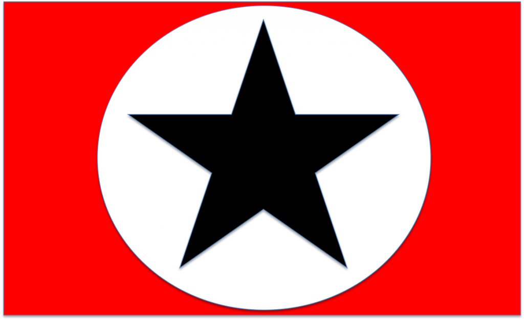
| Golan2072 | 08 Feb 2013 2:23 p.m. PST |
I did my own insignia for the Liberated Worlds, for which I use the Rebel Minis Sahadeen:
"We are but a tiny candle flickering against the darkness of our times." |
| clkeagle | 08 Feb 2013 5:19 p.m. PST |
"We are but a tiny candle flickering against the darkness of our times." Nice, Omer! I'm going to need some for my Russian United States of the Kirov system Keith, it sounds like you want something that implies both Soviet Russia and western democracies? Here's a basic Russian flag (in the colors of my own RUSK figures – easy to change to other colors) with a restored hammer & sickle, plus a few USA-style stars.
-Chris K. |
| AWuuuu | 08 Feb 2013 5:35 p.m. PST |
WOW Clkeagle you made it really sexy :)
Ok i know its a bit of rude to ask for some more time tha tyou sacrigficed in remaking it but could you make shield a little smaller ? (10%) ? And can I use it on my Blog ? What software are you guys using for this ? |
| Trojan Points | 08 Feb 2013 6:03 p.m. PST |
@clkeagle: wow, that's disturbingly close to my thoughts, I just stuck to the pan-Slavic colours and arranged the stars differently (I was looking for a nice looking constellation and by alliteration ended up with Cassiopeia which seems to be written with a K in Russian and fits nicely the space on the flag)…
|
| clkeagle | 08 Feb 2013 6:59 p.m. PST |
WOW Clkeagle you made it really sexy :)
Ok i know its a bit of rude to ask for some more time tha tyou sacrigficed in remaking it but could you make shield a little smaller ? (10%) ?And can I use it on my Blog ? What software are you guys using for this ? No problem. Like I said I want the practice. These are new skills that I'm trying to develop, and they'll be just as useful at my day job as they are on the hobby side. Here's a smaller shield and I vectorized it and the phoenix so it won't look as "pixelated."
You have my full permission to use this graphic for any purpose directly related to tabletop wargaming, including but not limited to blogs, printed documents, and custom decals. As far as software, I'm doing most of my rough work in PowerPoint. Sure, it's not a graphics program, but years of government work have left me embarrassingly skilled in its use. I'm switching over to the free program Inkscape for more and more tasks hopefully the whole process once I learn a few more steps. To find a shape that isn't in the Powerpoint object library (like the US highway shield, phoenix, and Lego space logo used in your image), I'm simply finding a royalty-free silhouette graphic with Google Image Search and cleaning it up/changing its colors in basic Windows Paint. Again, I'm hoping to develop enough skill in Inkscape to do it all the "proper" way. -Chris K. |
| Admiral Yi Sun Sin is my Homie | 08 Feb 2013 7:35 p.m. PST |
I was concerned mine was just too simple and while it is simple I appreciate the positive comments. My Titan Marines are now satisfied they have the right inspiration to begin the conquest of the galaxy. I'm impressed by your work Mr Harold, Chris K as well as everyone else's insignias. It's nice to see so much thought put into these.  |