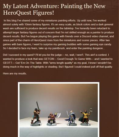
Editor in Chief Bill Editor in Chief Bill   | 03 Feb 2012 4:48 p.m. PST |
On a scale of 1 (awful) to 10 (excellent), rate the cover art for the new Vampire Counts codex for Warhammer:
|
| RobH | 03 Feb 2012 4:59 p.m. PST |
5, I think it is the weakest of the 4 versions. The Black/Green 2nd version was the best. |
| TheCount | 03 Feb 2012 6:08 p.m. PST |
3. Garish and poorly drawn, by past standards. I do wish GW would grow out of their Red&Blue phase. |
| corporalpat | 03 Feb 2012 6:11 p.m. PST |
2=low budget comic book quality…the subject is centered in the frame with very little dynamic tension created, there is a minimum of action, the lighting is sterile at best, if it were not for the semi realistic depiction of the subject it would barely classify as art…and I have a pretty loose definition of art. |
 John the OFM John the OFM  | 03 Feb 2012 6:21 p.m. PST |
It loks like here was a sale on blue and red ink. Wnat's a "meh"? 5? Maybe "less than meh". Make it a 3.
"Low budget comic book quality" indeed. |
| Sergeant Paper | 03 Feb 2012 7:24 p.m. PST |
lets just go straight to 1… this is weak sauce. |
| Space Monkey | 03 Feb 2012 8:19 p.m. PST |
3ish
The vampire Counts stuff in general seems garish… yet clunky IMO. |
| Mithmee | 03 Feb 2012 8:23 p.m. PST |
|
| Gokiburi | 03 Feb 2012 10:02 p.m. PST |
I give it 1.5 disinterested shrugs,
but then I've never been too fond of cyan vampires |
| fairoaks024 | 04 Feb 2012 3:29 a.m. PST |
Sorry boys, you are obviously all wrong, that right there is an 8
or 9, no seriously…….. Regards Jim
:-) |
| charliemike | 04 Feb 2012 4:07 a.m. PST |
5 at most.
But I stopped liking GW stuff, art comprised, some time ago while I still love some of their older stuff (maybe I'm simply old and everything was better in the past). Luciano PS: wifey says "2", it reminds her of a school project. |
| SeattleGamer | 04 Feb 2012 1:03 p.m. PST |
I'd give it a 5 for a comic book by an unknown, but from Games Workshop, and their army book at that (not just one of many internal bits of art) I'd give it a 3 at best. Doesn't come remotely close to capturing the look and feel of a Vampire Counts army. |
| jpattern2 | 04 Feb 2012 2:46 p.m. PST |
1. They're able to produce much better and more evocative artwork, and they should, especially for the cover of an army book. Nothing about that says "army." |
 miniMo miniMo | 04 Feb 2012 7:28 p.m. PST |
I'd have to go with The Count and rate it "1, 2, 3, 4, 5, 6, 7, 8, 9, 10!" |
| TheCount | 05 Feb 2012 3:24 p.m. PST |
|
| Given up for good | 05 Feb 2012 3:57 p.m. PST |
I like the bats so it gets a 2 for them but that's it. |
| billthecat | 08 Feb 2012 11:25 a.m. PST |
Based upon previous cover art and industry/consumer expectations: C- |