Is the use of the artistic acrylic paint wash, in preference to a commercially made wash (Citadel for example) that it gives a darker and more vibrant result? If not what is its purpose?
The use of arcrylic artist paints so called "heavy body" in tubes is that they have a much better capilary reaction, almost like oil paints and then they form like a second skin layer over the white primining.
I do mean artist acrlyic paints, not like the New Scale 75 tube acrylics, but brands like Schmincke, or Amsterdam Royal Talens Standard Series (my favourite now, due to the fact that you can small tubes of 20 ml and creamy consistency, very good value for money).
I mix this dark deep violet from crimson and Prussian blue, it could be a more warm hue like with a more reddish result or bluer.
In case one doesn't like to mix, paynes grey is doing also a very nice job.
For pre dominant white uniforms I don't use this wash but I use natural umber.
The wash, not that super thin, I thin down with water and Vallejo flow improver and some AK ultra varnish matte (this one only sparingly).
By this I am improving the capillary reaction and the flow.
Horses:
You have indicated when you paint the block colour on a horse (for example Citadel Tau Light Ochre) care must be taken not to paint over the deep shadow. Should similar care be taken when the final glaze with artist watercolours (of burnt umber mixed with ValLejo airbrush flow improver), or is it so thinned that it is not necessary?
No this coat of artist water colour is just painted over all the top, nostril holes and eyes excluded.
I thin those water colours down as I feel appropriate and what kind of darkness or brightness of the end result I like to achieve.
I also use water and Vallejo airbrush flow improver. Then with a damp brush lift off the water colour where you like to achieve lights, this is trial and error and personal taste. Like on horse coats I like a more prominent contrast to reflect the sheen of the horses.
Figures:
When you paint uniforms, do you also a) deep shadow with the dark violet wash b) block colour light and c) then use a darker artist watercolour glaze of the colour of the uniform?
Exactly the same, as you will have realized those block painted coat has to be much lighter than the end result when artist water colour is painted over, for coats or other dresses I don't overdo the contrast.
What artists watercolours do you use?
I use Schmincke there this brand is stored in my local artist hobby store in town and I like to support my local dealer as much as possible.
Any good quality brand will do, fine pigments are very important and then stick to his brand there you will soon note that for example sepia brown of Schmincke is different to a sepia brown of another brand or almost any other colours as well.
How do you do black?
Basically the same, like foe black leather I like to do a cold black so my block colour would be a light blue grey, the artist water colour wash / glaze would be black with a bit Prussian blue and then lift off again the lights in case of more polished items, more contrast.
For black felt or black dress colour I use a reddish grey (just a tinge) like again using crimson to add in my mix of black and white paint or a strong dark read colour and consequently the artist water colour is black with a bit crimson as well.
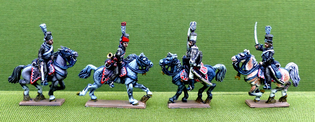
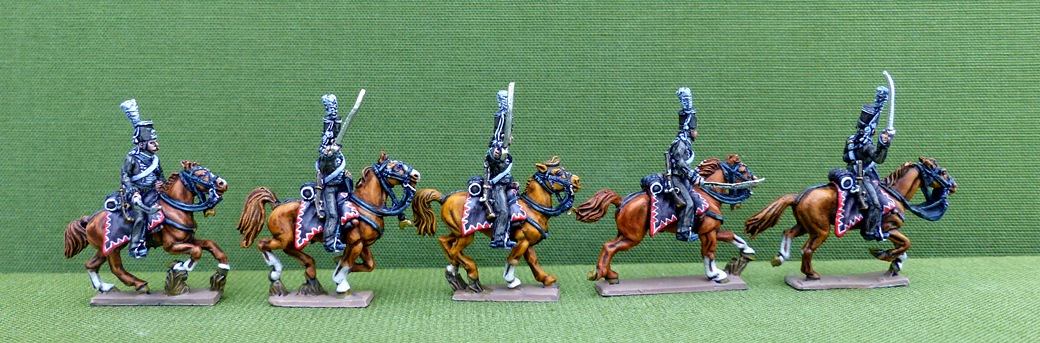
For the hussars above I did the saddle cloth and the felt of the mirliton like this.
For the dress in that case I added burnt umber to the grey and my water colour layer was consequently black with a bit burnt umber as well.
How do you do white?
My system of lazy and easy painting is not working on that one, more tomorrow or in due course.
In case of any more questions please ask. In the end a lot still will be trial and error I just can point out the way how it works and what material to use.
Brushes, not too small Raphael 8402 or 8404 size 2 and 3 work very well, in case of big scale 28 mm even a size 4 would be good to slap the artist water colour over the horse.