| Fizzypickles | 10 Oct 2013 8:46 a.m. PST |
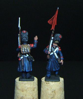
I'm painting some French Old Guard for a gaming friend who is absolutely obsessed with the authenticity of 'French Blue' I've taken the RGB hex values of some reproduction French cloth and basically lightened it by 25% to account for scale but my gut feeling is it is too dark. I'd appreciate some subjective input from others please. [URL=http://s1316.photobucket.com/user/La_Coaster/media/OG_zps76028654.jpg.html]
[/URL] |
| razuse | 10 Oct 2013 8:53 a.m. PST |
I think it looks right…I have seen lighter blues but studying several French period paintings….I think darker…you have hit it to me. |
| MajorB | 10 Oct 2013 9:06 a.m. PST |
I've taken the RGB hex values of some reproduction French cloth and basically lightened it by 25% to account for scale but my gut feeling is it is too dark. I'd appreciate some subjective input from others please. There is no guarantee that "reproduction French cloth" is an accurate shade. Given the vagaries of the dyeing process and the fact that even now different batches of ostensibly the same dye will result in a slightly different shade, any chance of replicating an "authentic" colour is but wishful thinking. |
| Fizzypickles | 10 Oct 2013 9:13 a.m. PST |
Yeah, I completely agree Major, given that early French uniforms were dyed using Indigo but had to revert to using woad after the British blockades proves the point. I guess it's all about the Tabletop aesthetics. |
| Fizzypickles | 10 Oct 2013 9:19 a.m. PST |
Thx razuse….I think my m8's obsessiveness is rubbing off on me! |
| Cerdic | 10 Oct 2013 10:50 a.m. PST |
It was a very dark blue. That is about as accurate a description you are going to get given the distance in time and the textile technology of the period! |
| A Twiningham | 10 Oct 2013 11:00 a.m. PST |
I would stick with this. It seems close to the color used in period paintings and it really pops. Very nice brush work! |
Shagnasty  | 10 Oct 2013 11:32 a.m. PST |
|
| wrgmr1 | 10 Oct 2013 11:42 a.m. PST |
Looks like a good color to me. Nice paintwork!! |
| rmcaras | 10 Oct 2013 11:46 a.m. PST |
French Blues? B.B. Roi? Howling Loup? Grand Maman Thornton? |
| Sapeur | 10 Oct 2013 12:15 p.m. PST |
Painting is superb.
Colour looks as if it is correct, considering the possible variations that would have occurred at the time. |
| idontbelieveit | 10 Oct 2013 12:17 p.m. PST |
That looks pretty good to me. |
| Clive Osborne | 10 Oct 2013 12:19 p.m. PST |
Fizzypickles is absolutely right – Indigo first then woad. Given basic technology at the time, no real !quality control" consistency on original colour. On campaign, with time, all would have faded. How many shades of faded dark blue jeans have you seen ? Dark blue – pretty dark is about right but then it's all about aesthetics and personal; taste on the table and allowances for colour on small figures.
You seem to have got it about right and I like the shading and highlights. Looks great to me. |
| Brian Smaller | 10 Oct 2013 1:50 p.m. PST |
And then try wearing a coat for six months in all weather and it will either be black or the colour bleached out by rain and sun. That is why I am never too fussed by having the exact colour. |
| Hugh Johns | 10 Oct 2013 2:16 p.m. PST |
Technically, I think it's too bright.
Aesthetically, it seems to me that if it's a work for hire it's not my opinion that counts. |
| Jeigheff | 10 Oct 2013 4:14 p.m. PST |
Yes, colors look lighter and less bright at a distance. I also realize that miniature scale has to be taken into account. However, I'm one of those people who don't like to see dark colors (such as French or navy blue, or Russian green) depicted too lightly on miniatures. That might mean that less color contrast can be displayed, but that's my personal taste. In summary, I don't think your blues are too dark at all. |
| Fizzypickles | 10 Oct 2013 4:49 p.m. PST |
Goodness me, thank you all very much, always nice to have a little ego massage from time to time. I think the general consensus is 'go with it'. I certainly wouldn't go any darker as that pic is under quite bright light and they do in fact look quite authentic at arms length 'on the table'. I was very tempted to go for another extreme highlight but now I've read the general opinion I think I'll leave them at that! Many thanks to all esp rmcaras lol. |
 Condotta Condotta | 10 Oct 2013 8:22 p.m. PST |
Like the effect and want to replicate it. Please share your paint selections. Vallejo? |
| Fizzypickles | 11 Oct 2013 6:57 a.m. PST |
Sure Condotta, yes all done with vallejo apart from the primer coat for which I nearly always use Scale 75 Black Primer. I'm afraid I didn't measure my colour mixtures drop by drop (I'm an idiot)but I can list them in descending order. Blues: Dk Prussian/Dk Sea Blue/Black approx 3:1:1
Dk Prussian neat
Dk Prussian/Intense Blue/Lt Grey approx 5:2:1 Reds: Black red
Red (33)
Red (29) Flesh: Shadows flesh/orange brown
Flesh base/light brown
Flat Flesh
Musket:Camo Bl. Brown
Flat Brown
Mahogany Brown Bkpack:Spinter blotches II
Beige Brown
Brown sand or Cork brown Whites:Lt Grey
Off white
White (tiniest of highlights) Blacks:Black
German Grey
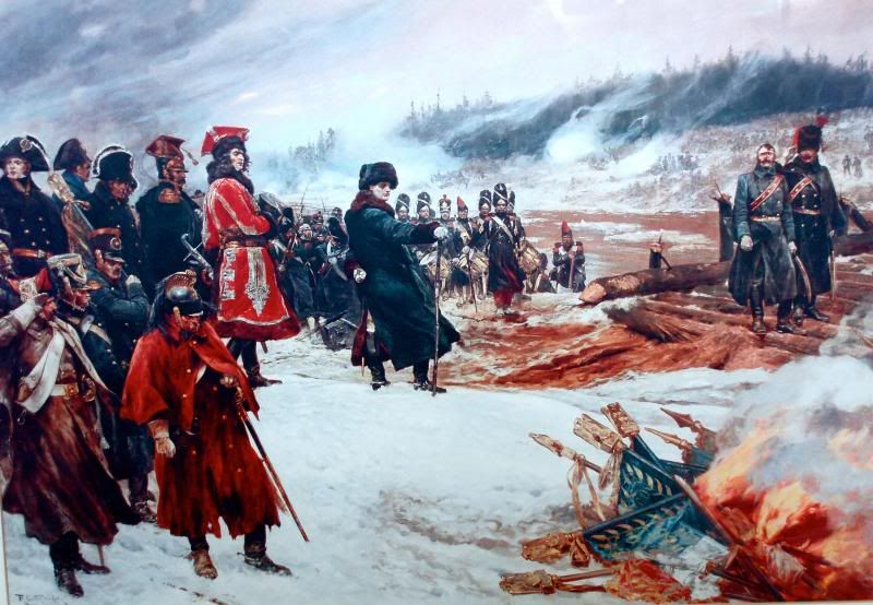
London Grey For all metals I use Vallejo model air, Bright brass/sepia wash for brass plate, bright brass/aluminium for buttons and Gun/steel/Aluminium for musket & bayonet. And to conclude. I used this wonderful picture as inspiration. [URL=http://s1316.photobucket.com/user/La_Coaster/media/ENHANCEDP7250013_zps992ad6c2.jpg.html]
[/URL] SIC TRANSIT GLORIA MUNDI – RETREAT FROM MOSCOW
by RICHARD CATON WOODVILLE (1911) |
| Condotta | 11 Oct 2013 10:15 p.m. PST |
Lance, much appreciated. That painting is very inspirationali indeed. Thank you for your post! |
| Fizzypickles | 12 Oct 2013 8:33 a.m. PST |
You're very welcome. If you find the blue highlights to light then more Dk Prussian, if too grey then more intense blue. That is how I did it. Regards the painting, I'd be interested what any of the Nappy experts out there make of the drum major or sergeant or what ever he is to Napoleon's right hand side. He appears to be wearing red leg wear and also has red lining to his greatcoat? |
| Cerdic | 13 Oct 2013 10:27 a.m. PST |
When was that painting painted? If it was a few decades after the event the artist may have seen contemporary French troops in their red trousers. Amazingly some artists are not big uniform buffs! That Tracey Emin can't tell a Voltigeur from a Grenadier! And don't get me started on Damien Hirst….. |
| le Grande Quartier General | 12 Nov 2013 8:23 a.m. PST |
Any artist that depicted standards burning BEFORE the eagle was removed can't be relied on, can they? |
 deadhead deadhead | 12 Nov 2013 8:51 a.m. PST |
I thought the whole point was to burn the eagles. The French actually set far less importance to the flag than to the scrawny bird perched on top………. and the blue? I would have gone darker personally, but photography exaggerates highlights and shading, depending on use of flash and white balance. The grenadiers are great (should not the grenade on the bearskin top be in aurore with white edging?) |
 Mserafin Mserafin | 12 Nov 2013 9:49 a.m. PST |
I thought the whole point was to burn the eagles. Given the technology of the time I don't think it would have been possible to burn the eagles. Bronze doesn't burn well at all. |
| deadhead | 12 Nov 2013 10:14 a.m. PST |
Oh yeah……yeah……..gulp………now how can I salvage any credibility here? Let's see, many artists have captured the Burning of the Eagles….but they must have all got it wrong. I know! The eagles still extant are often described as gilded, which could have been over a wooden carving, which burns nicely. Except it wasn't, it was over bronze, which was used to make cannon barrels precisely because it is heat resistant. Right, what did Boney's lads do with the Eagles on return from Moscow then? There are a few in Russian hands, Kazan Cathedral and Moscow Army Museum, but not sure even those are from 1812 retreat. Must have dumped them somewhere! Apologies, we are a long way off blue |
| Widowson | 12 Nov 2013 11:25 p.m. PST |
Blue looks great. Bearskin tassles should be white. grenade in rear cloth patch aurore with white outline. |
| summerfield | 13 Nov 2013 12:57 a.m. PST |
Remember the darker the blue the better the coth as more Indigo dye was used. Natural dyes were mordants so were not as wash resistant as modern reactive dyes. Also the blue was indigo so consider the dark denin colour rather than a phthalocyanine blue as you have there. It is a slightly different hue. Lovely painting.
Stephen |
| Fizzypickles | 15 Nov 2013 8:28 p.m. PST |
Blue looks great. Bearskin tassles should be white. grenade in rear cloth patch aurore with white outline
Yeah the tassels are all white except for the Coy sergeant which is red, at least I think that is correct. I wasn't aware of the Grenades being anything other than white or gold tbh. Does anyone have a reference link?
Many thanks. |